
Our Favourite Online Portfolios by Journalists

Robyn Petrik
Published onJosephine Moulds - Freelance Journalist
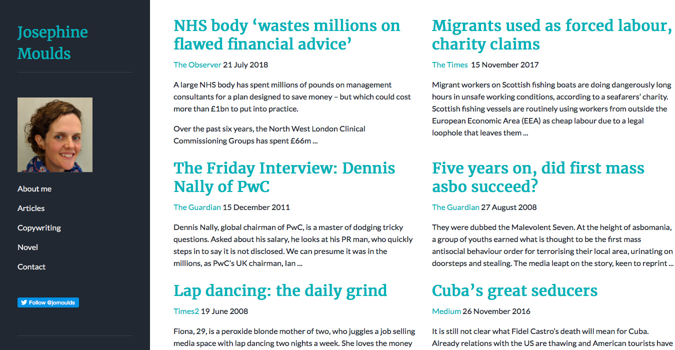
In her online portfolio, Josephine Moulds lets the headlines of her articles stand in the spotlight with a text-based design. Her simple navigation menu lets visitors find their way easily, but also shows at a glance that she does copywriting and fiction writing as well.
Drew Tewksbury - Multimedia Journalist
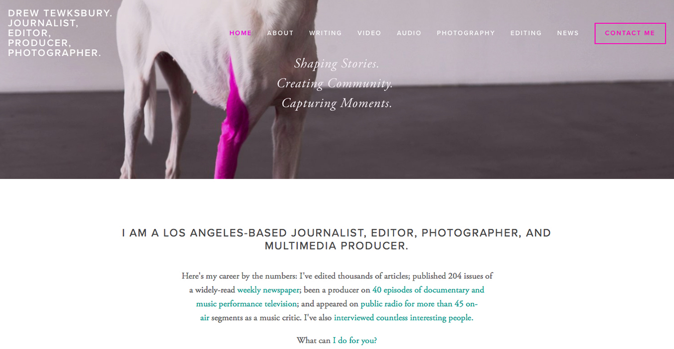
Drew Tewksbury is a multimedia journalist and has done a great job showcasing his many talents in his portfolio. Above the fold, Drew has an eye-catching image and tagline to immediately draw readers in. Further down the homepage, there are clear links to his different specialities, including writing and editing.
Dana Wood - Journalist
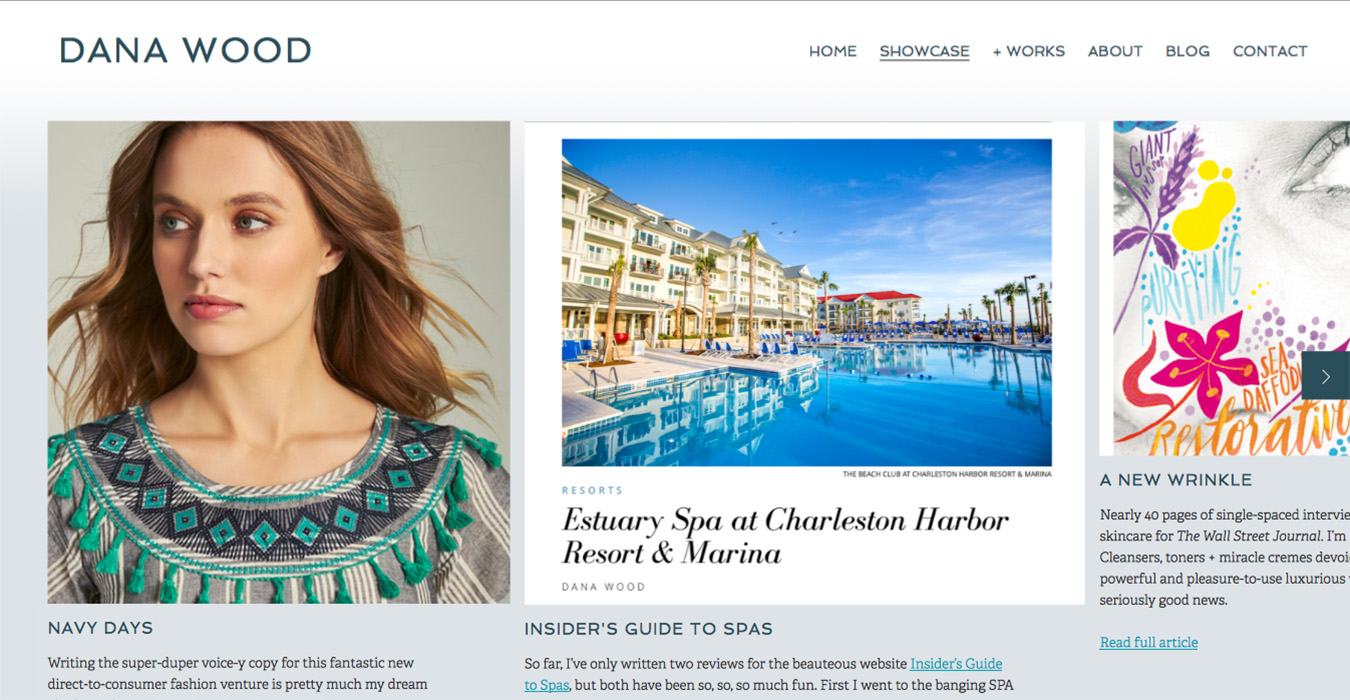
Dana Wood's online portfolio features a clear navigation bar, including a specific contact page so potential clients can easily get a hold of her. However, the real star of the show is her 'Showcase' page. Dana posts samples of her work with images from the publication, giving readers a true feel for each piece.
Gary Phillips - Sports Journalist & Journo Portfolio User
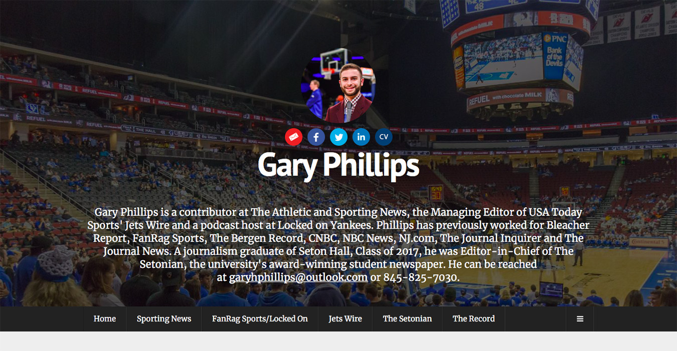
From the first glance of Gary Phillips' writing portfolio, you can tell he's a sports journalist. He's used sports images in both his profile and cover photo, and his bio quickly summarizes his experience. Gary has taken full advantage of Journo Portfolio's features to create a great portfolio.
Gary Phillips is using the Journo Portfolio theme Dark.
Krystal Nurse - Journalist & Journo Portfolio User
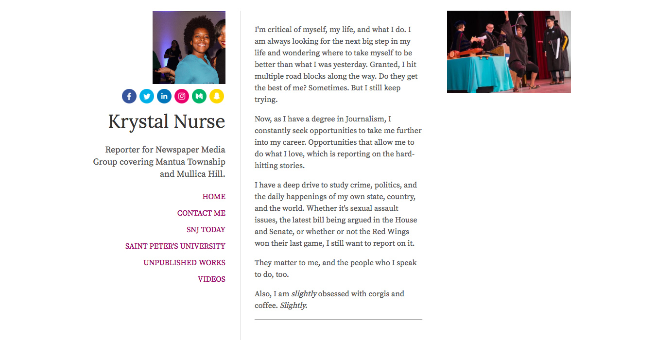
Krystal Nurse has gone with a clean and minimalist look for her journalism portfolio. She's kept her bio above the fold, blending her personality in with her professional experience. Krystal has also highlighted her social media links, and as an avid Twitter user, incorporated her Twitter feed on the homepage.
Krystal Nurse is using the Journo Portfolio theme White.
Jack Aldwinckle - Freelance Journalist & Journo Portfolio User
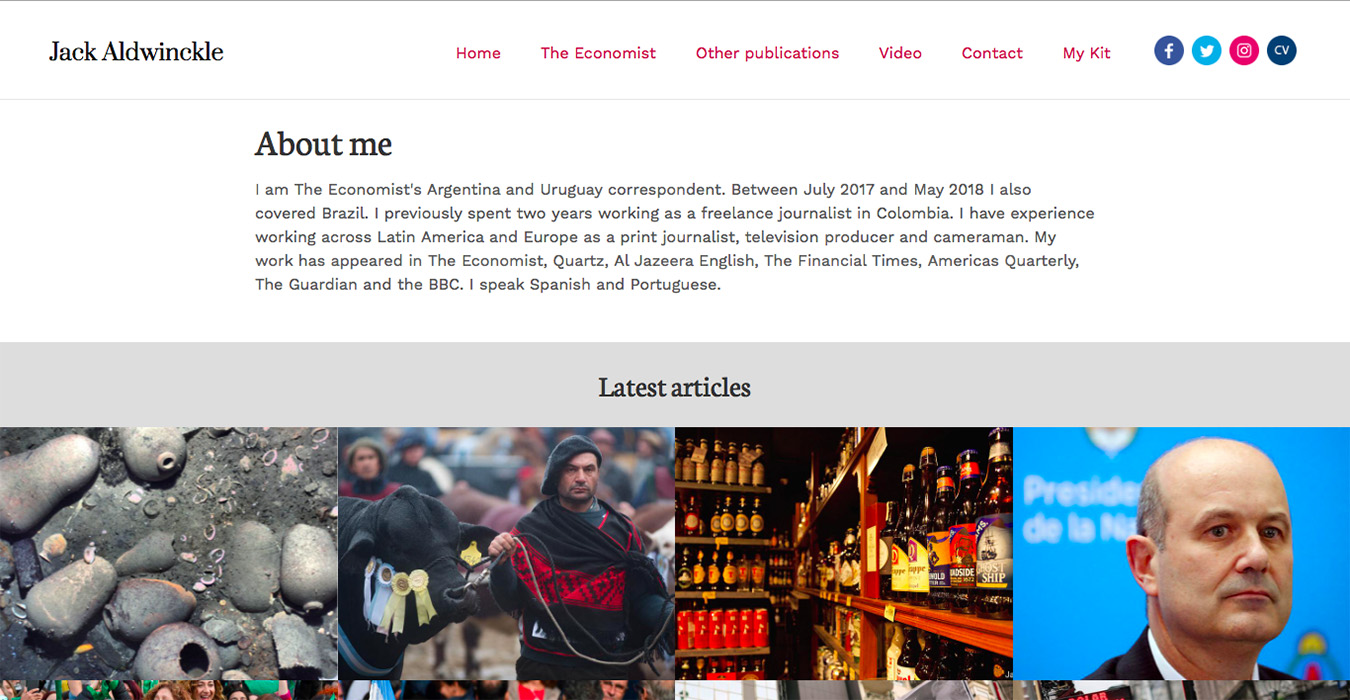
Jack Aldwinckle has used Journo Portfolio to create a full portfolio, using the fixed navigation bar to create a traditional website feel. Jack uses the images from his articles to their full potential, taking advantage of the hover feature to draw in readers.
Jack Aldwinckle is using the Journo Portfolio theme Respond.


