Making the best use of Images on your Writing Portfolio

Journo Portfolio
Published onThere are three places that your image choice is important: your cover image, your profile image and the individual images used with your articles.
Choosing a Cover Photo
Most of Journo Portfolio's themes allow you to use a large cover photo either as a header or sidebar, precisely because it's such a powerful way to portray yourself. Simply changing this large cover photo from a dark moody image to a bright, light one completely changes the way your portfolio comes across and inevitably how you yourself are perceived.
Selecting images for your cover photo is hard with so many types of images to choose from but there are a few easy rules to start with:
- Contrast: the image should make it easy to read any text in front of it such as your name or bio. This ones pretty obvious but is really important, avoid very light images when using white font. Also don't forget to check the contrast on different devices as it can appear very different.
- Quality: using a high resolution image that isn't blurry is again very important. Your cover image will be responsively stretched to fit even the largest screen so you want it to be a minimum of 1500-2000px wide.
- Effects: over use of image effects can end up looking silly so this needs to be subtle. Typically you should stick to effects such as blurring, contrast and brightness adjustment.
Next we want to think about what kind of journalist or writer you want to portray yourself as. This can help for deciding on a subject matter for your cover photo. Sometimes this is obvious, such as for a sports correspondent or a foreign correspondent where good and powerful related imagery is easily available. For a local reporter covering a range of issues this choice is less clear.
Another good place to begin looking for photo ideas is at your articles. Are there any stand-out images on any of the articles you have already written, or do they have a common theme that could be a good choice to search for?
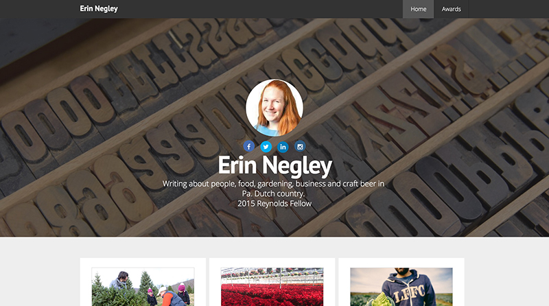
Erin Negley opted for a letter-press image. Old fashioned, writing-related imagery such as typewriters are a popular choice.
Tips for your Profile Image
- You would think it goes without saying, but never leave the default outline of a person image on your portfolio. This looks like you haven't bother to finish your site and you're not serious enough about it to upload an image. If you really don't want a profile image at least remove the default image.
- Choose a high-resolution image (although it only needs to be small, 200px by 200px should be fine).
- Crop it well so it is position correctly. You may need to try this a few times and re-upload it until you are happy.
- Consider picking a photo of you without a distracting background. This looks more professional and can be more distinctive.
- If you don't have any good photos that are appropriate, take one!
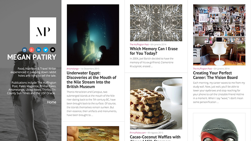
Megan Patiry went with a logo-style profile image, using the cover photo to display an image of herself. This really helps to create a Megan Patiry 'Brand'.
Displaying images with your articles
- It is normally best to be consistent with how you display your articles on your portfolio. Either display photos for all of your writing pieces or none of them.
- If you do use images avoid very narrow long images which display poorly.
- Be prepared to edit the default photo that is grabbed from your URL by Journo Portfolio, or replace it completely.
- Avoid using screenshots of text, as this will inevitably look blurry and messy. Photographs are normally the best bet.
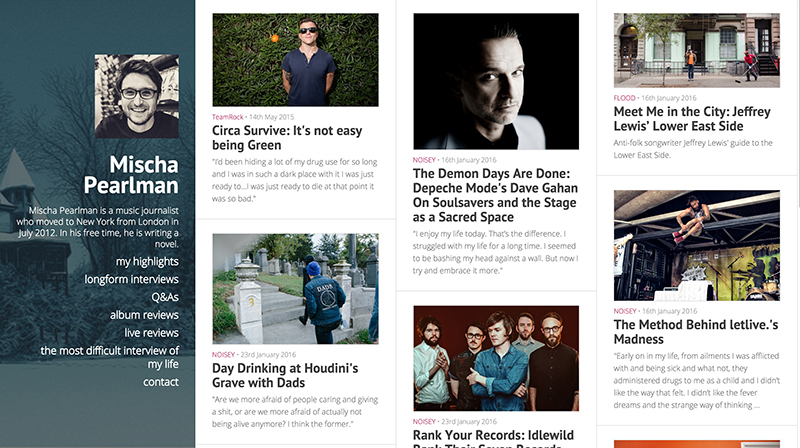
Good choices all round? Mischa's dark cover photo and profile image create a distinct identity while the images on his articles are well defined and sized correctly.
Where to find images?
Of course the use of any imagery on your website shouldn't violate someone else's copyright, but don't worry this doesn't restrict your choice of available images too much. One great site for finding free-to-use, high-resolution imagery is unsplash.com, but there are other sources as well.
An advanced search on Google can help you find open-source imagery fairly easily, while a browse of related wikipedia articles might give you some ideas of the kind of thing you want.
For the biggest range of photos consider purchasing one from a large stock photo library, this will give you a massive choice of images on almost any subject matter and can be a worthy investment to create the look you want on your portfolio.
Getting feedback
When you think you have finished choosing all your imagery, try getting some feedback from someone you think would be honest with you. It's much better for a friend or colleague to tell you they think something doesn't look right before it reaches a prospective employer.


