
Our Top 10 Favourite Online Writing Portfolios Built in 2022

Jessica Michael
Published onSearching for some inspiring writing portfolios? In this article, we have picked out our top 10 favourite writing portfolios built with Journo Portfolio in 2022. Read on to see view the portfolios and read our top tips for building your own writing portfolio site.
As a writer, you might expect your writing alone to be enough to showcase your skills - but a well-designed portfolio is vital. A good writing portfolio acts as a multiplier, amplifying your work and showcasing your experience and skills. Think of it as another powerful way of differentiating yourself in a crowded market.
A good writing portfolio acts as a multiplier, amplifying your work and showcasing your experience and skills.
There is no single "best" writing portfolio design - for every writer's work, personality and goals are different. However, most good portfolios share a common set of good features which help to make them successful:
- An easy-to-use and clear navigation.
- Excellent content, usually more than just a list of articles.
- Legible fonts and good use of layout and white space.
- Fast loading, reliable and secure.
- Careful use of color and imagery.
All 10 examples below have these features in common, which helps them stand out from the crowd.
Our top 10 writing portfolios built in 2022
1. Rachel Ho
Visit Rachel's portfolio here: www.rachelkh.com
Rachel Ho is a freelance film critic based in Toronto, Canada. She is a regular contributor for Exclaim!, POV Magazine and That Shelf. Rachel's portfolio stands out due to its brilliant use of film shots as page header images. This gives the site a distinctive look and perfectly captures the spirit of her work. She has designed her site to use the full width of the page, making the most of the available space. This allows her to display an enormous amount of interviews, reviews and features. The clear site navigation in the header and on the home page ensures that the quantity of work displayed does not feel overwhelming. The home page, in particular, does a great job of showcasing different types of work, as well as linking to other parts of her portfolio.

2. Henry Wong
Visit Henry's portfolio here: www.henryljwong.com
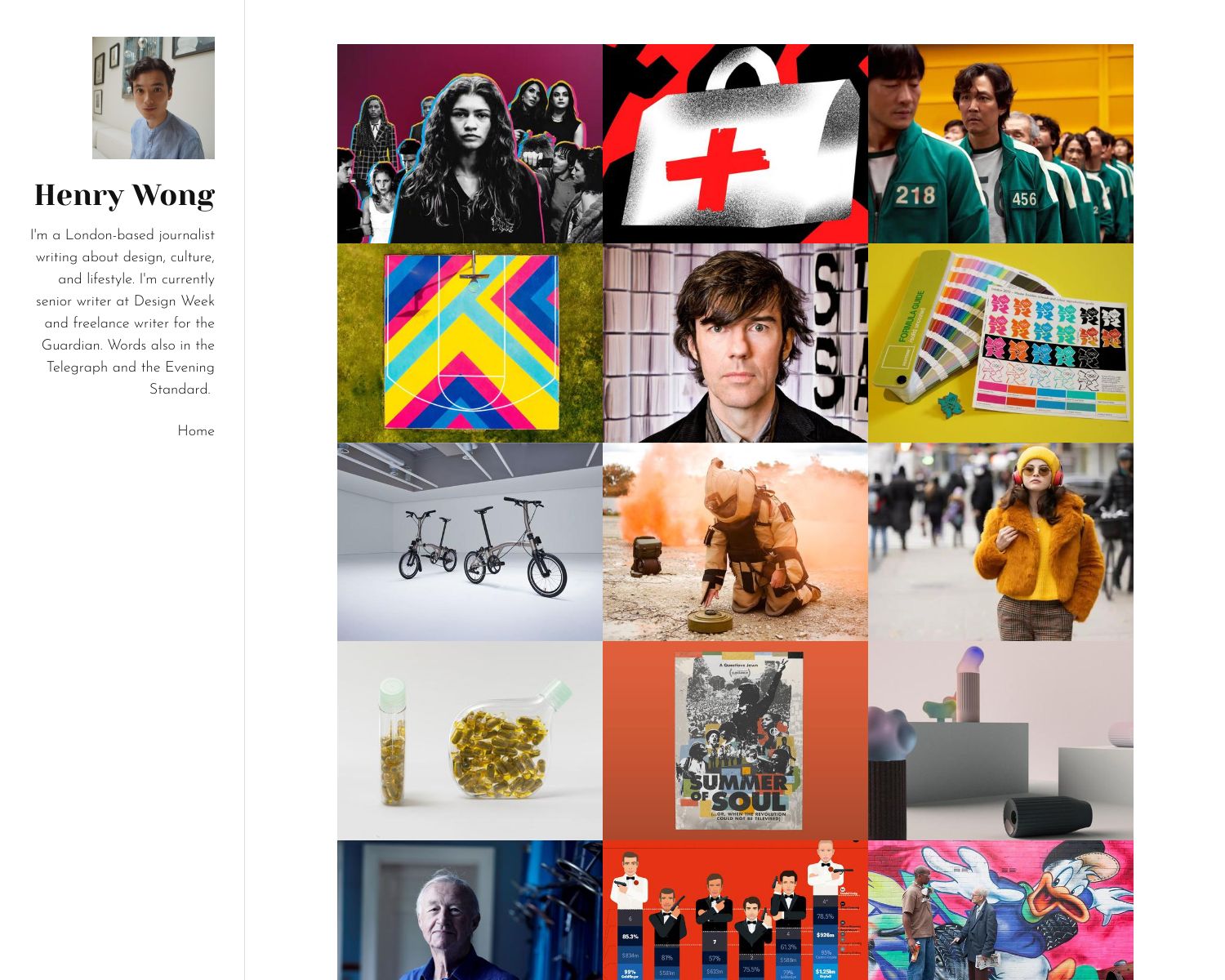
Henry is a London-based journalist writing about design, culture, and lifestyle. He is currently a senior writer at Design Week and a freelance writer for the Guardian. We love how Henry has used an image-focused layout to showcase his writing. This works so well because of the excellent images he has added to his articles. The image grid is very distinctive, draws you in and makes you want to read each piece in turn.
3. Clara Harter
Visit Clara's portfolio here: www.claraharter.com
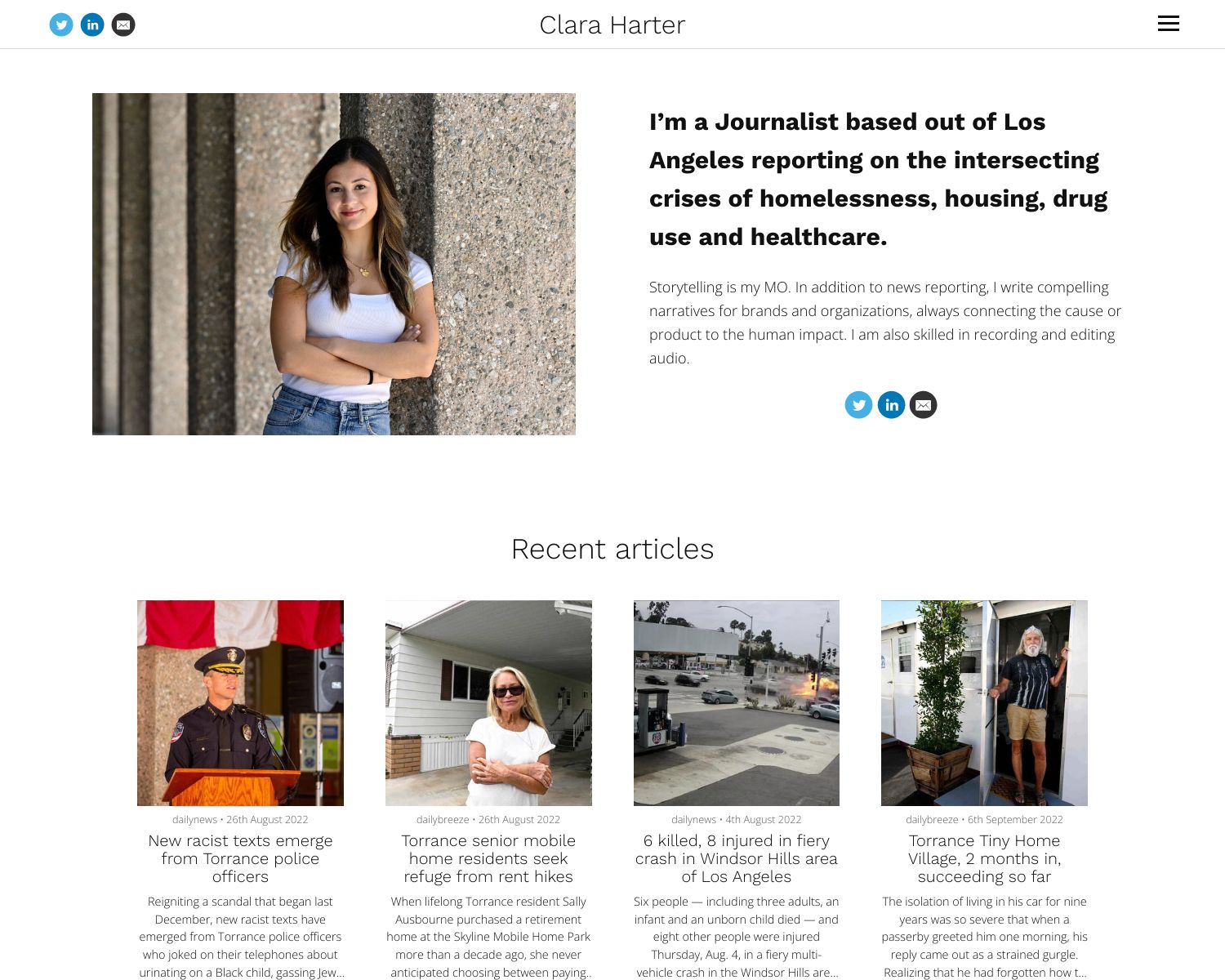
Clara is a Los Angeles-based journalist who works at the Southern California News Group. She has had stories published in the LA Daily News, Long Beach Press Telegram, Pasadena Star News, Malibu Times and Santa Monica Daily Press.
From the moment you land on her home page, you understand exactly who she is and what she does. This is thanks to her bio and profile picture presented at the top of the page. Her portfolio is well structured, loads fast and looks very professional.
4. Nancy Jiang
Visit Nancy's portfolio here: www.nancyjiang.com
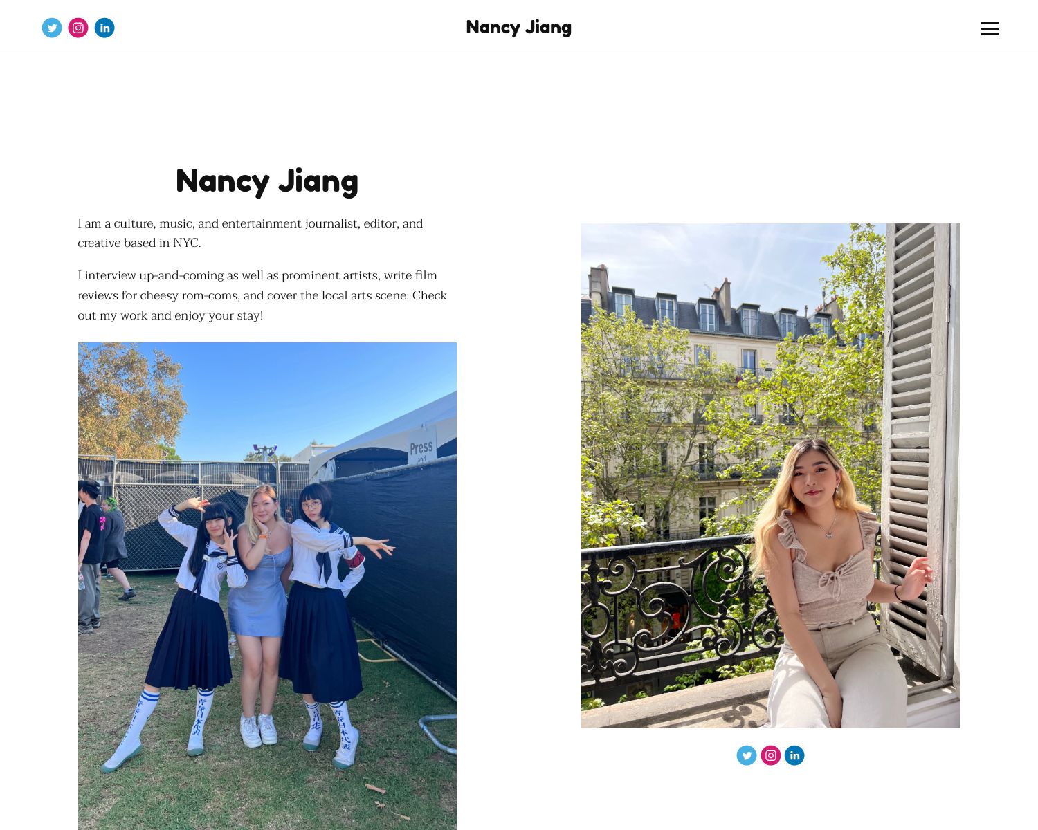
Nancy is a NYC-based culture, music, and entertainment journalist, editor, and creative. We like how Nancy has used two offset photographs on her home page to create a distinctive about page and display her social media links.
5. Gwendolyn Desilva
Visit Gwendolyn's portfolio here: www.gwendolyndesilva.com
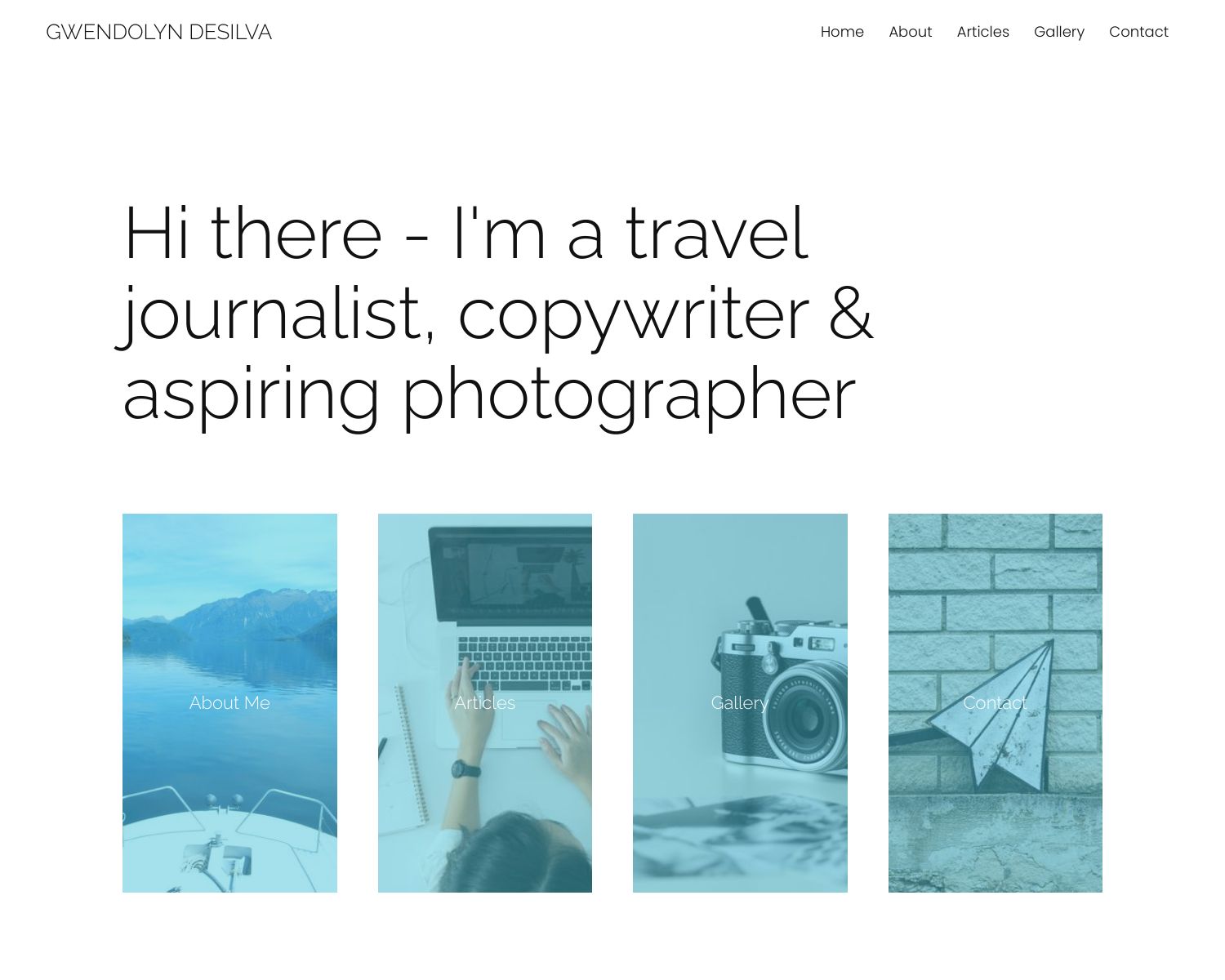
Gwendolyn is a writer based in Denver, Colorado. Her hobbies/passions include hiking, snowshoeing, bike riding, paddle boarding, exploring art galleries and photographing graffiti art. Gwendolyn's portfolio looks clean and fresh. The large intro headline on the home page makes you want to read on to learn more. The four 'link blocks' on the home page provide clear navigation to key parts of her site. As an aspiring photographer, Gwendolyn has added a Gallery page to showcase her work.
6. Austin Charvey
Visit Austin's portfolio here: www.austincharvey.com
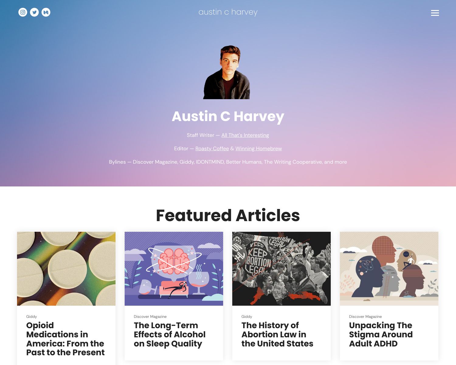
Austin is a staff writer at All That's Interesting and editor at Roasty Coffee & Winning Homebrew. We love how his portfolio features a gradient background image and sans-serif fonts to create a very modern design.
Austin puts his best work at the forefront with four featured articles at the top of the home page. The rest of his work features below. This means his portfolio serves as both a quick intro to his best work AND a directory of everything he has published. Putting your best work in a "Featured Articles" section is a brilliant way to showcase your skills.
7. Maria Valentino
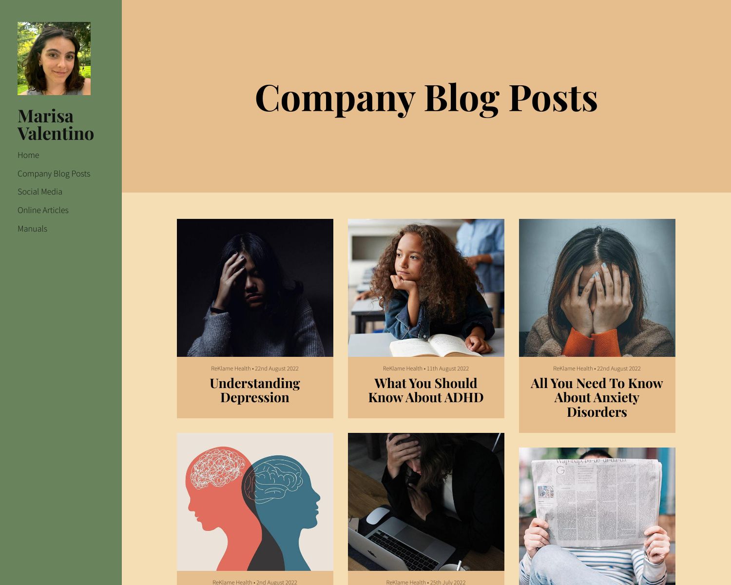
Marisa is a copywriter and content creator who is passionate about storytelling in visual and written formats. Marissa's bold choice of colors makes her portfolio very memorable. Green can be a hard color to use on a website, but Maria has aced it here. She has definitely succeeded in creating a distinct and unique site.
Her portfolio also has clear links on the home page and a consistent layout and design across all her pages. This is vital to ensure your site feels cohesive and professional.
8. Kevin Williamson
Visit Kevin's portfolio here: www.kwwriter.com
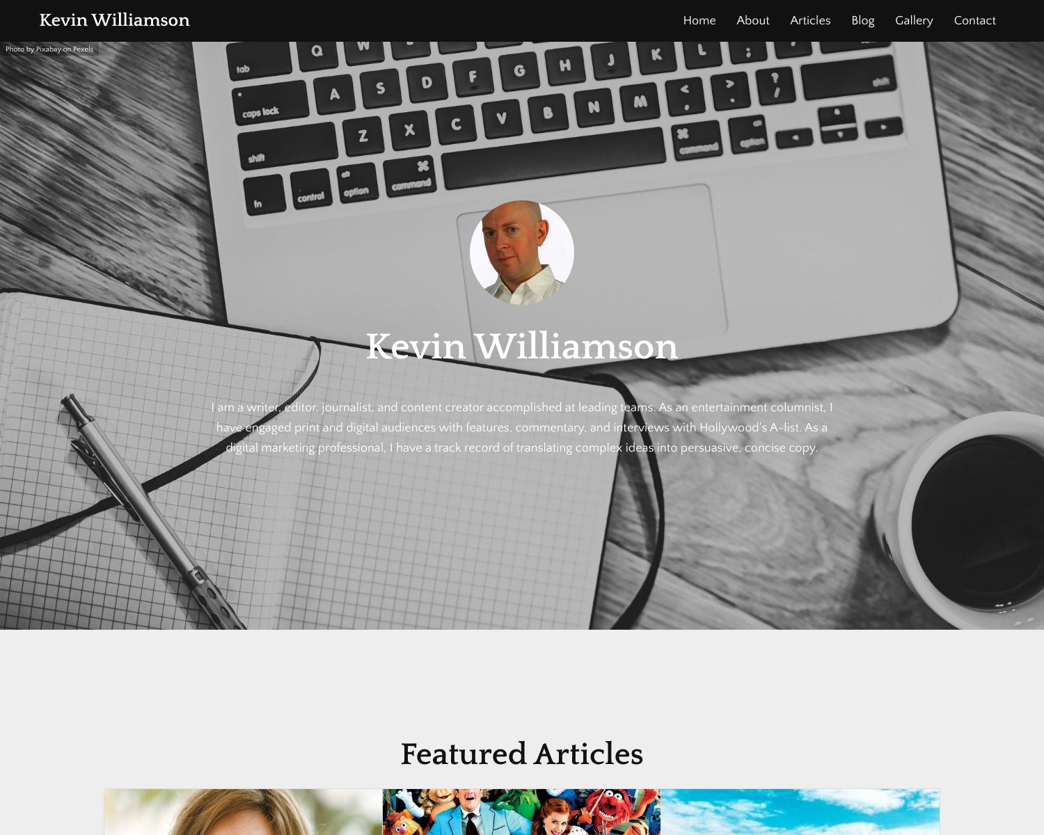
Kevin Williamson is a writer, editor, journalist, and content creator and has written for over 200 publications. Kevin's portfolio home page has a great variety of content which is great for getting to know his writing. Different article sections show off the variety of his work while a contact form gives you an easy route to get in touch. We also like how he has used a different style of article for his featured article section, visually separating it from the rest of the content.
9. Olivia Harden
Visit the portfolio here: www.oliviaharden.com
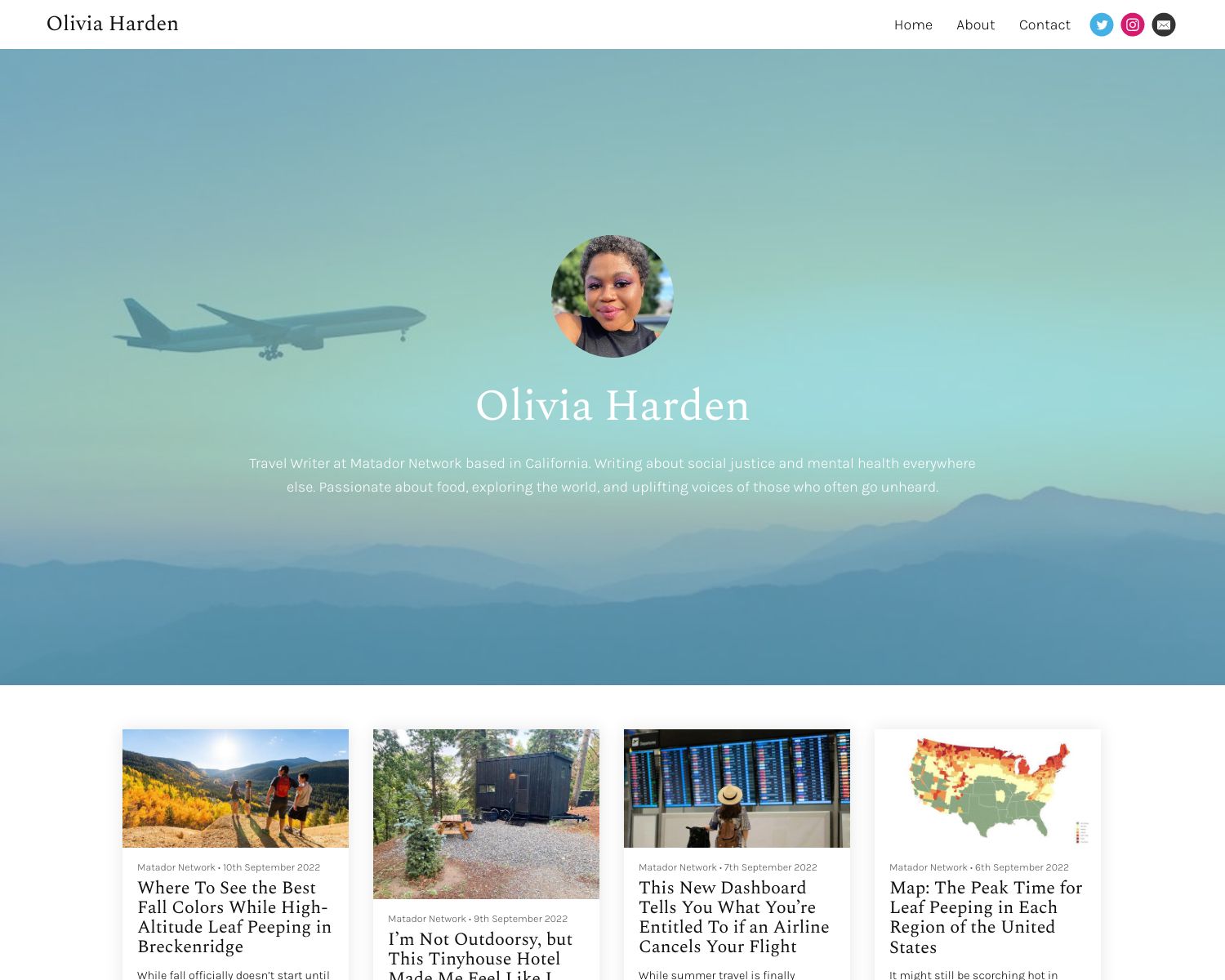
Olivia is a Travel Writer at Matador Network based in California who been featured in Buzzfeed, PBS' Rewire and more. Olivia puts her work front-of-stage on the home page. The hero image she has used on her home page is perfect for a travel writer. It is important to pick background images that are not too noisy to detract from the text or foreground. Olivia has also applied a transparent overlay to ensure her bio remains readable.
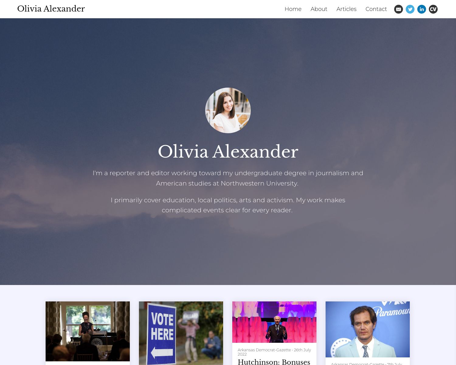
10. Olivia Alexander
Visit Olivia's portfolio here: oliviagalexander.journoportfolio.com
Olivia is a reporter and editor working toward an undergraduate degree in journalism and American studies at Northwestern University. Olivia covers education, local politics, arts and activism. Her portfolio is easy to navigate and simple to use while putting her work front and centre.
Why you need an online writing portfolio
In an increasingly digital world, it’s more important than ever to have a place where you can showcase your work, skills and experience. A writing portfolio is not just a list of every piece of work you've ever had published. It is a powerful tool that you can use to promote yourself, find new clients or further your career goals. No matter what type of writing you do, your portfolio can be a single place you can point people to learn about who you are, what you do and what you can offer.
So whether you’re searching for a new job or trying to find your own clients, developing an online writing portfolio is a smart move.
Our top tips for building your own stunning writing portfolio
Building a portfolio from scratch can seem overwhelming at first. It is best to start small and then build on it later. Our tips below are worth bearing in mind as you build your site to help you create an awesome portfolio.
Keep the design simple
A complicated design with too many colours or font styles is the quickest way to build an ugly portfolio. Stick to using one or two font styles and a palette of two or three complementary colors. Keep spacing consistent and ensure your pages all look like they belong to the same site.
Make the home page engaging
Don't leave your home page lacking content. A good starting point is to have an introduction, some of your best articles and links to key parts of your site.
Put your best work first
Your best writing samples should be at the top of your page. These examples should show off your best work and showcase exactly what you can do. Make sure these samples are relevant to the types of jobs you’re applying for or the work you are looking for.
Have clear navigation and content hierarchy
If visitors can't find your other pages they may as well not exist. Keep navigation links short and easy to understand. Use a good font size and good contrast from the background.
Make it easy to contact you
Your writing portfolio should also have an easy way to contact you. This could be your contact details or a contact form. This way, clients can reach out to you from the same page where they read your writing samples.
Use call-to-actions on every page
Your goal should be to guide visitors through your site on a journey. For example, you may want to guide them from your home page to your work page, then to a services page before they contact you on the contact page. You can help people on this journey by putting links or buttons to the next page at the bottom of each page. Use a clear "Call-to-action" command such as "Read more" or "Get in touch" to encourage the visitor to take the action.

7 Common Mistakes Made When Building an Online Writing Portfolio
Is one of these 7 common mistakes that we see every day impacting how well your portfolio works?
Which platform should I use to build my portfolio?
Modern website-building platforms such as Squarespace, Wix or WordPress are very powerful. They make an excellent choice to build a portfolio depending on your requirements and goals.
Journo Portfolio was built for writers from the ground up and is packed with features to help you build your portfolio and manage your writing work.
Our users often come to try Journo Portfolio after being frustrated with the experience on other platforms. They often find it is quicker and easier to build a great portfolio with our site builder.
As you will see from the variety of the examples above Journo Portfolio can be used to create a very unique site. This often comes without the complexity of the major website builders.


