
Top 25 Copywriting Portfolio Examples to Help You Land Clients

Jessica Michael
Published onWhether you're a copywriter with years of experience or you're just starting out, an outstanding copywriting portfolio is a must to secure new clients and land the gigs you want. From an engaging About page to a portfolio home page template that impresses, we've gathered 25 copywriting portfolio examples that will show you the best ways to build a portfolio that will get you hired.
What should a copywriting portfolio include?
Every copywriting portfolio will be different, depending on experience level, special skills, and the types of copywriting services you provide. However most examples of good copywriting portfolios will include the following:
Home Page
When you think about what you want to include on your portfolio home page, consider that this will be the first impression potential clients get. What is your strongest selling point? Should you start with your bio that lists your experience or dive right into your copywriting examples? Don't worry. We've got examples below with just about every different way you can format your Home page.
About Me
Most clients want to know a little about the person they're hiring. This page is a chance to highlight your personality and professional experience. This is also a great place to define your target audience and what kind of clients and projects you'd like to work with.
Copywriting Samples
Make sure you include samples of each type of content you offer, and try to stick to only your best work. There's no need to include everything you've done if it isn't going to lead to getting hired. If you are trying to build a copywriting portfolio with no experience, you can use mock samples and case studies, as long as you define them as such.
Contact Page
Make sure your contact information is easy to find so clients don't have to search to find a way to reach out.
Copywriting Portfolio Examples
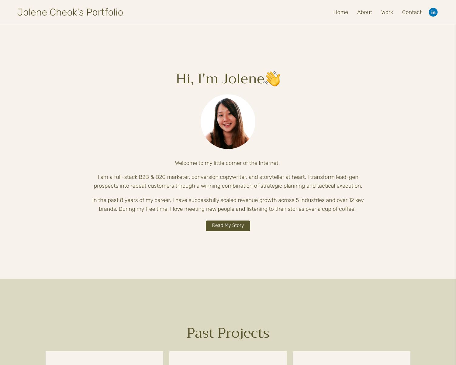
1. Jolene Cheok
Visit Jolene's Portfolio here: jolenecheok.journoportfolio.com
WHAT WE LOVE: Jolene keeps her color theme subdued so that your attention is drawn to her text. Her Home page immediately introduces you to her copywriting experience by featuring name brands she's worked with. She divides her work into newsletters, copywriting, and featured articles which can be accessed prominently displayed buttons on her copywriting portfolio Home page.
SPECIAL FEATURES: Under her professional bio on her About page, she has a button that allows you to schedule a 15-minute consultation call with her through bookk.me, making it easy to convert impressed visitors into instant clients.
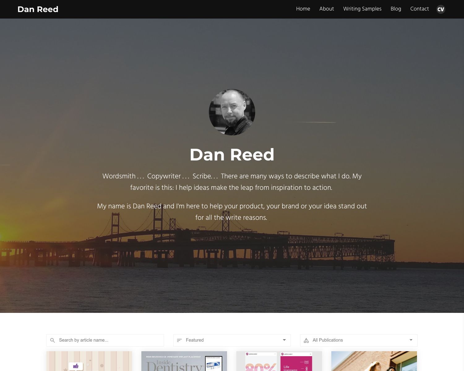
2. Dan Reed
Visit Dan's Portfolio here: danreed.journoportfolio.com
WHAT WE LOVE: Dan's black-and-white design is professional and clean. He utilizes an impactful background photo for his Home page, as well as including a professional black-and-white photo for his profile pic. Because he excels in long-form content, he gives plenty of space for multiple long-form copywriting samples on both his Home and Writing Samples page.
SPECIAL FEATURES: Dan includes a pdf of his CV. This is a great feature to include if you have extensive professional experience that can't be adequately conveyed in your copywriting portfolio.
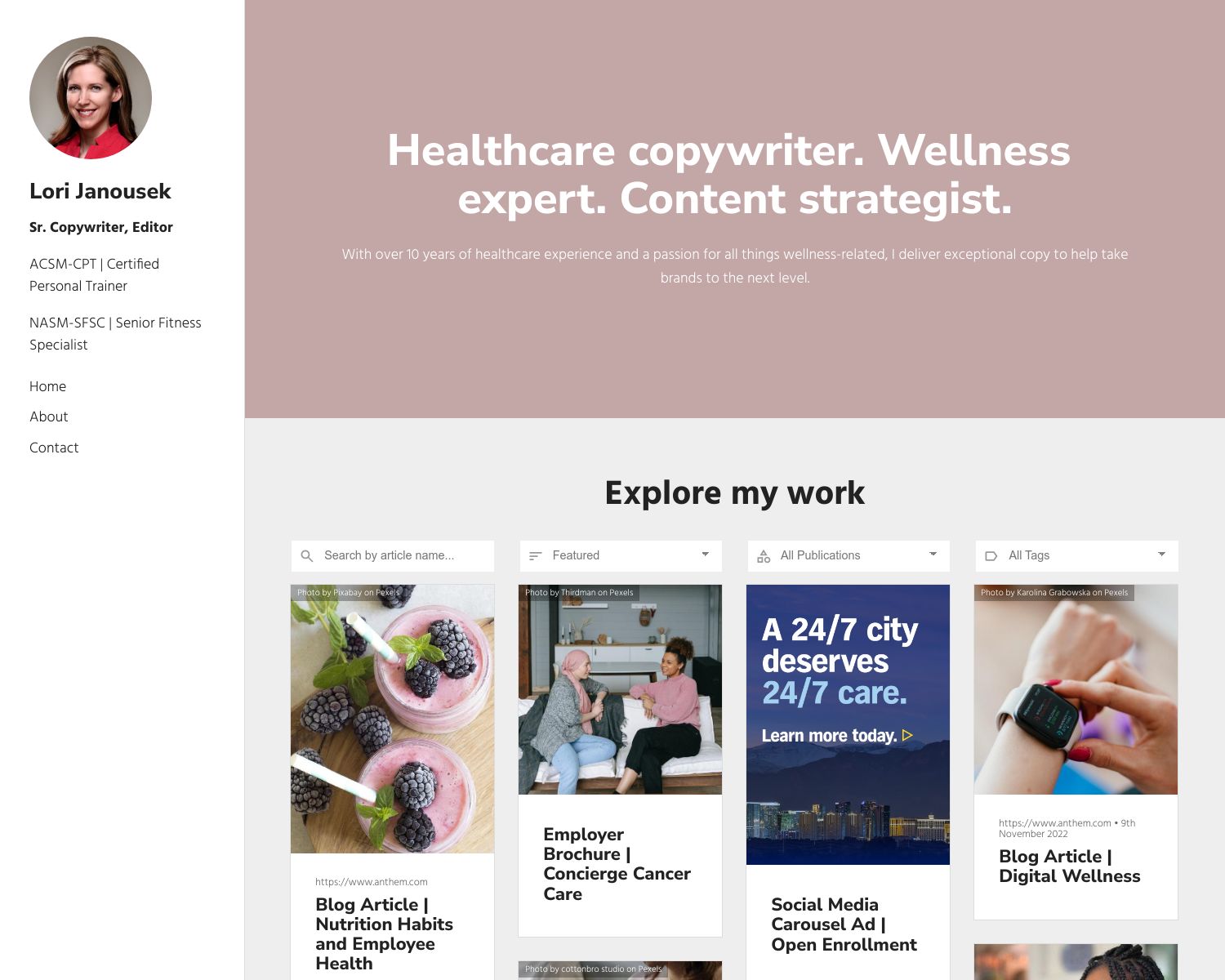
3. Lori Janousek
Visit Lori's Portfolio here: lorijanousek.journoportfolio.com
WHAT WE LOVE: Lori keeps her site fresh by featuring only 3 pages. Her copywriting samples are displayed on her Home page, her About page features a short professional bio, and she finishes it off with a Contact page for inquiries. This is still plenty of space to see her exceptional featured work, which showcases her range and expertise without distraction.
SPECIAL FEATURES: Lori opts for a sidebar menu for her copywriting portfolio, with an excellent profile pic and a list of her credentials. That means her professional experience is on display on each page, and helps to establish her credibility.
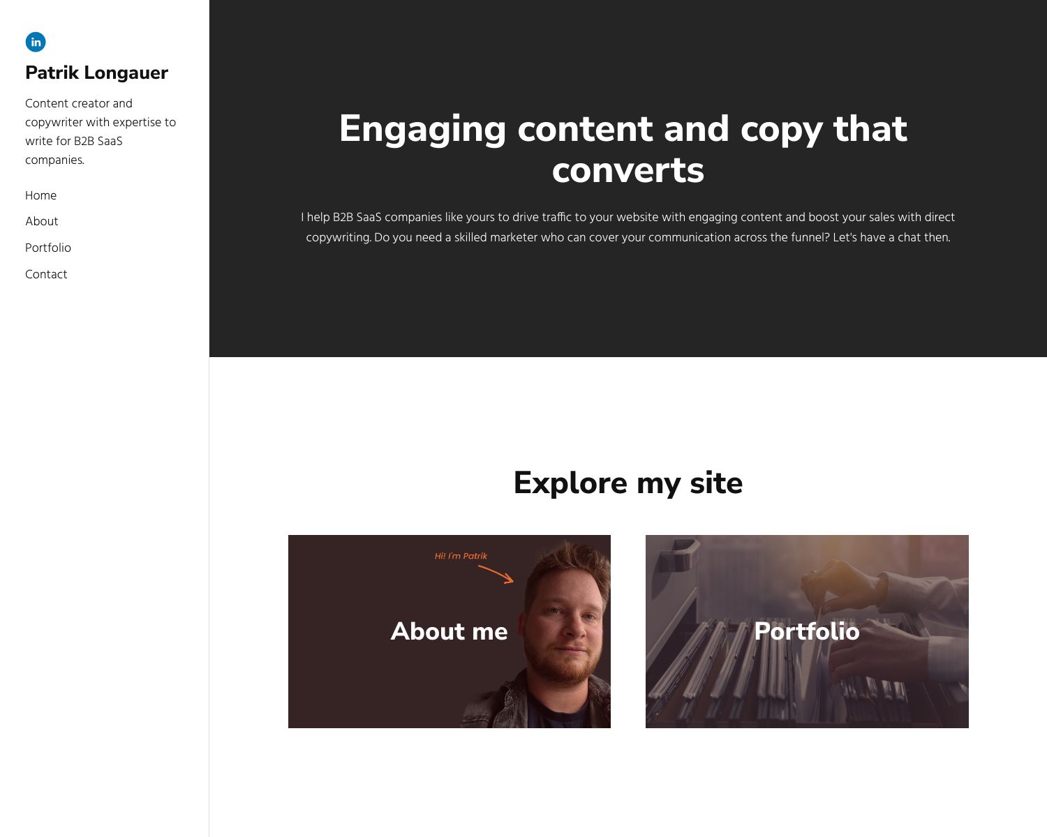
4. Patrik Longauer
Visit Patrik's Portfolio here: patriklongauer.journoportfolio.com
WHAT WE LOVE: His Home page uses a bold black header to set off his call-to-action and immediately establish his copywriting persona. His Home page is easy to navigate, with buttons that lead to his About page or his Portfolio page. We like that Patrik's not afraid to inject a little humor into his About button.
SPECIAL FEATURES: Patrik's Portfolio page divides his work into content type by utilizing a grid format with beautiful example photos for each type of work. Each category then has a button that leads you to specific content pages, where you can select a project for even more information. This allows visitors to do a deep dive on exactly the type of content they're interested in, without getting lost on the site.
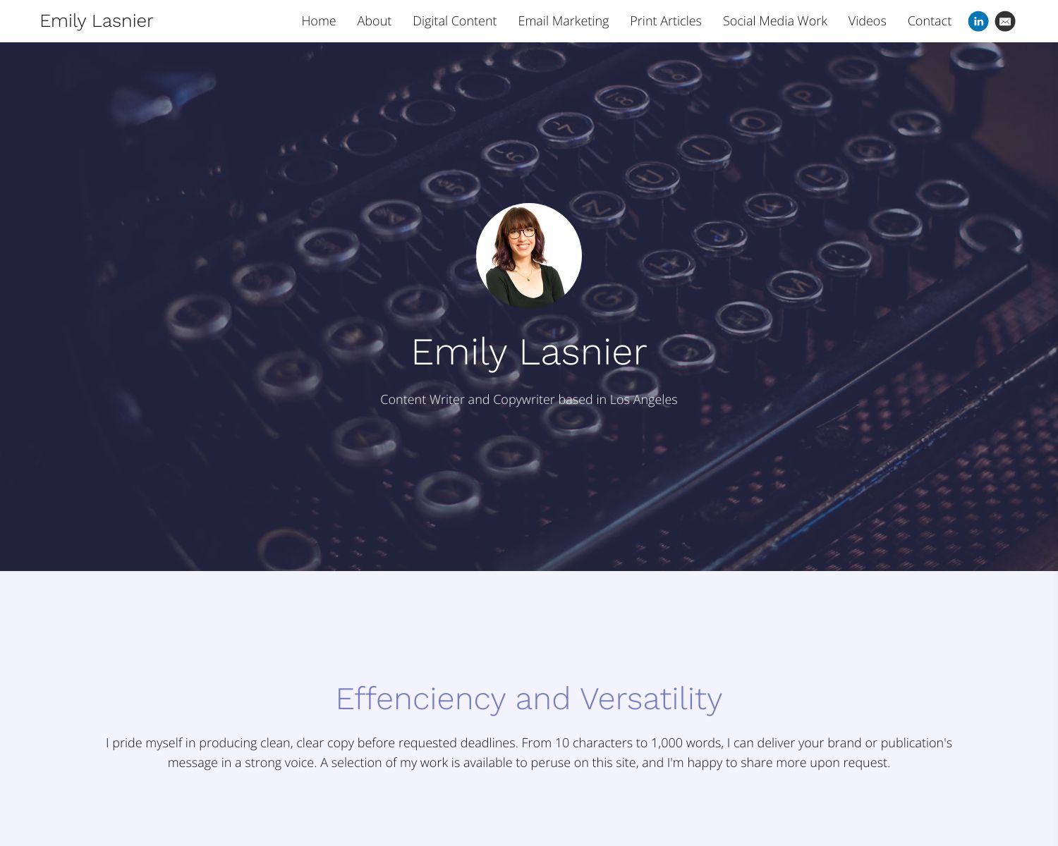
5. Emily Lasnier
Visit Emily's Portfolio here: emilylasnier.portfolial.com
WHAT WE LOVE: Emily makes great use of the header menu on her copywriting portfolio to direct visitors to the type of content they're interested in. With pages for digital content, email marketing, print articles and social media work, potential clients can see her range and check out samples they're most interested in.
SPECIAL FEATURES: Emily does an excellent job of only featuring 4 to 6 copywriting samples in each category to showcase her best work. Potential clients don't get overwhelmed and are impressed by what she has to offer. We also love her impactful profile picture on her About page.
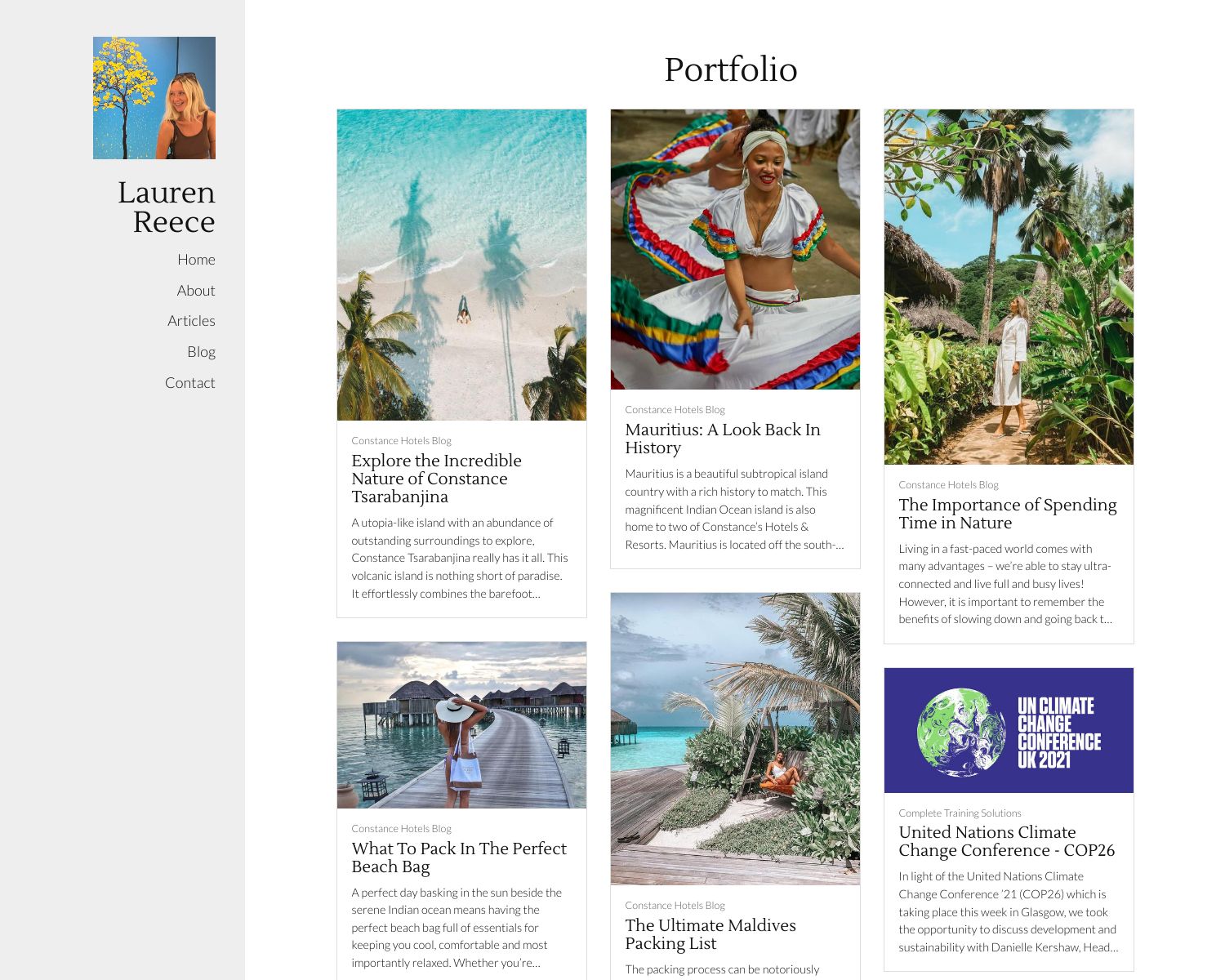
6. Lauren Reece
Visit Lauren's Portfolio here: laurenreececreative.journoportfolio.com
WHAT WE LOVE: Lauren makes stunning use of beautiful color photography set against a white backdrop. From her bold profile picture to the featured article photos, her aesthetic matches the artistic drama of her chosen content. She also sets her Portfolio page as her Home page, so potential clients dive right into her work.
SPECIAL FEATURES: Lauren makes a point in her bio to mention that she is open to a broad range of copywriting topics. That lets clients know that even though she's specialized in certain areas, she's open for work that isn't currently spotlighted in her copywriting portfolio.
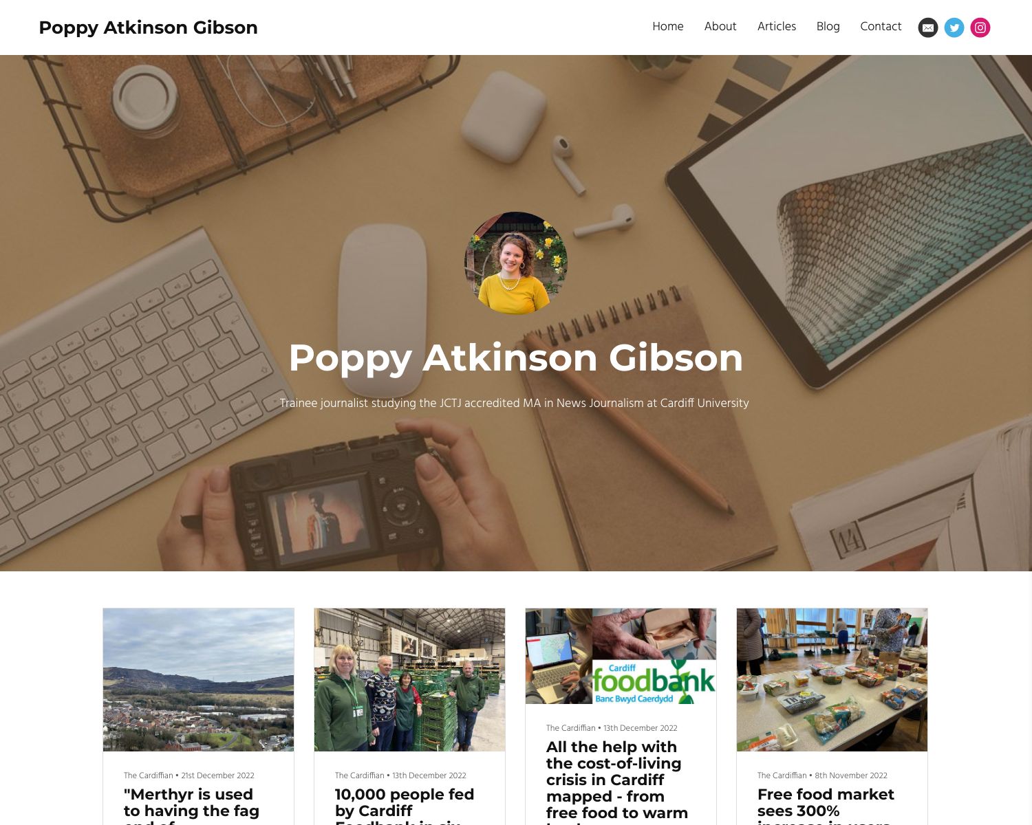
7. Poppy Atkinson Gibson
Visit Poppy's Portfolio here: poppygibson577.journoportfolio.com
WHAT WE LOVE: Poppy's portfolio is a great example of a student writing portfolio and shows how much you can leverage the writing you do as part of your degree program into an impressive copywriting portfolio. Poppy's About page emphasizes her studies, and her portfolio highlights her in-depth writing for Cardiff's student news site, as well as other respected publications. Poppy has set herself up well for future clients and writing employment opportunities by developing her portfolio as a student.
SPECIAL FEATURES: Poppy includes a vibrant Blog page that features blog posts from her "A Pop of Color" personal blog. A great blog page can be a wonderful addition to a copywriting portfolio, showcasing more range than your individual writing samples might on their own.
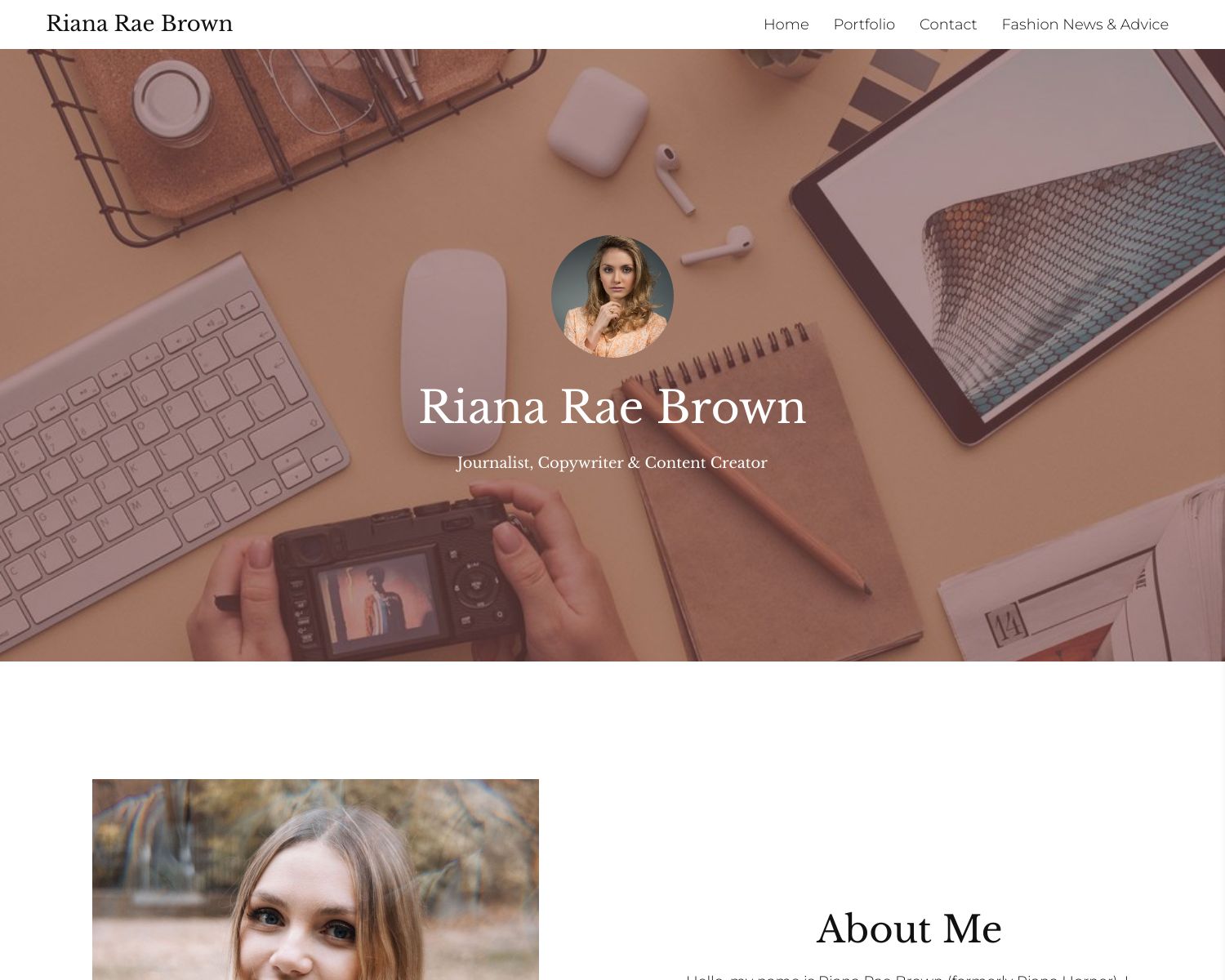
8. Riana Rae Brown
Visit Riana's Portfolio here: rianaraebrown.journoportfolio.com
WHAT WE LOVE: Riana features her bio on her Home page, so potential clients instantly get a sense of who she is. Her soft color palette matches her gorgeous professional profile pic, and her grid layouts are simple and classy. She uses large buttons to divide her content into type (news reports, features, copywriting, and press releases), which is a great aesthetic choice that also allows for easy navigation.
SPECIAL FEATURES: Riana includes a section called Fashion News & Advice, where she collaborates with fashion brands on beautifully designed short-form blog posts. These give you a sense of her writing style and her creative flair, and shows you can use your copywriting portfolio to create active content.
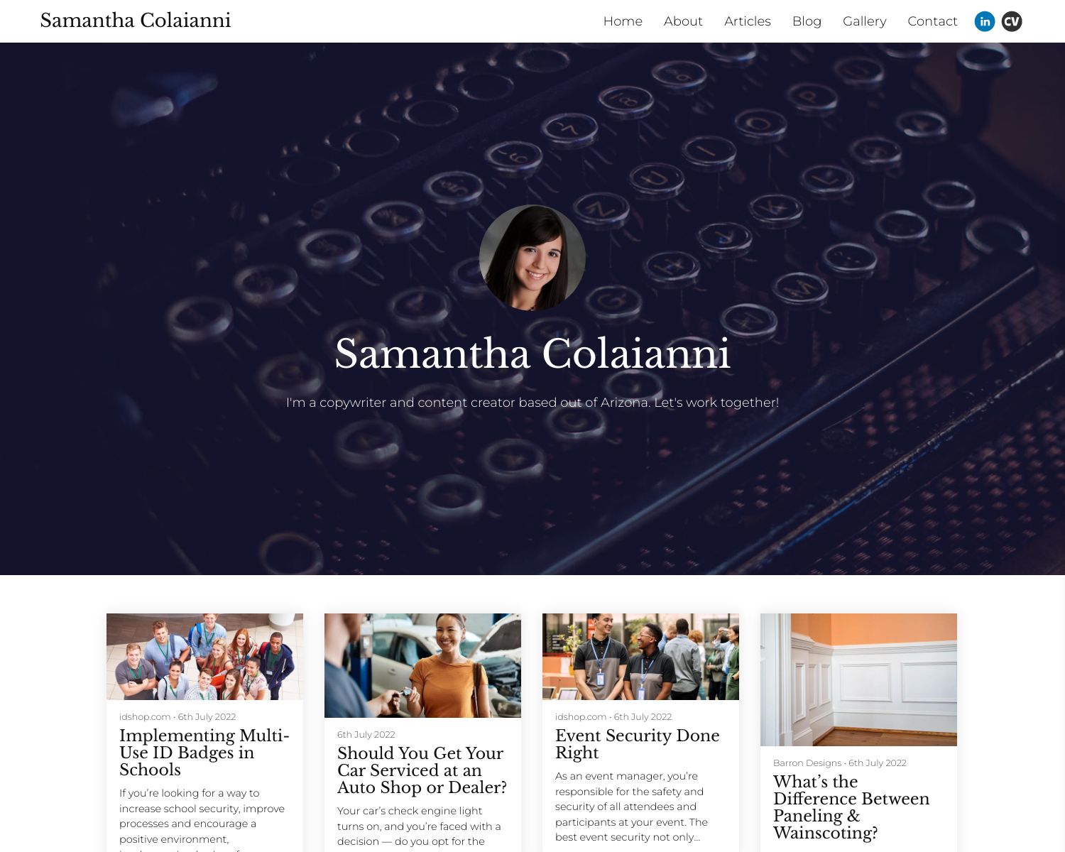
9. Samantha Colaianni
WHAT WE LOVE: Samantha's rectangular grid format that she uses on her Portfolio page allows her to display a higher number of copywriting samples without the layout becoming distracting. Her Blog page implements an F-shaped layout, which creates easy scanning on mobile devices and a clean design for desktop.
SPECIAL FEATURES: Smantha keeps her social media buttons front and center by including them in her header menu and at the bottom of her bio on her About page. This means clients can easily check her social media accounts, which as a social media copywriter can be a huge selling point.
10. Naomi Dornfeld
Visit Naomi's Portfolio here: www.naomidornfeld.com
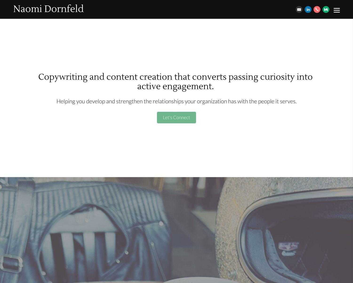
WHAT WE LOVE: Naomi keeps everything on one scrollable page, which is a plus for mobile users. The first thing potential clients see when they land on her Home page is a Schedule a Free Consultation button, so they have an immediate opportunity to connect. She follows that with a two row listing of services she offers, so clients know what they can hire her for.
SPECIAL FEATURES: Naomi includes testimonials with her About section, which gives her instant credibility. And while she includes a section of her best copywriting samples, she places them at the bottom of her page so the emphasis remains on the variety of services she can provide.
11. Chelsea Reid
Visit Chelsea's Portfolio here: itschelseareid.journoportfolio.com
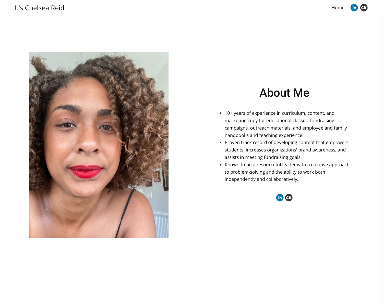
WHAT WE LOVE: Chelsea also makes use of the single-page template that works so well on mobile devices, but she uses much bigger blocks in her design lay-out for a bolder impression. She starts her copywriting portfolio with a concise About section that emphasizes her expertise in educational copywriting. Her large displays for her social media content and copywriting samples really make her page a visual stand-out.
SPECIAL FEATURES: Chelsea uses a scrolling banner to highlight the graphics she's created for brand logos and podcast cover art. Not only does this help her create movement and interest on her page, it lets her display more content in a smaller space.
12. Kunal Sharad
Visit Kunal's Portfolio here: kunalsharad.journoportfolio.com
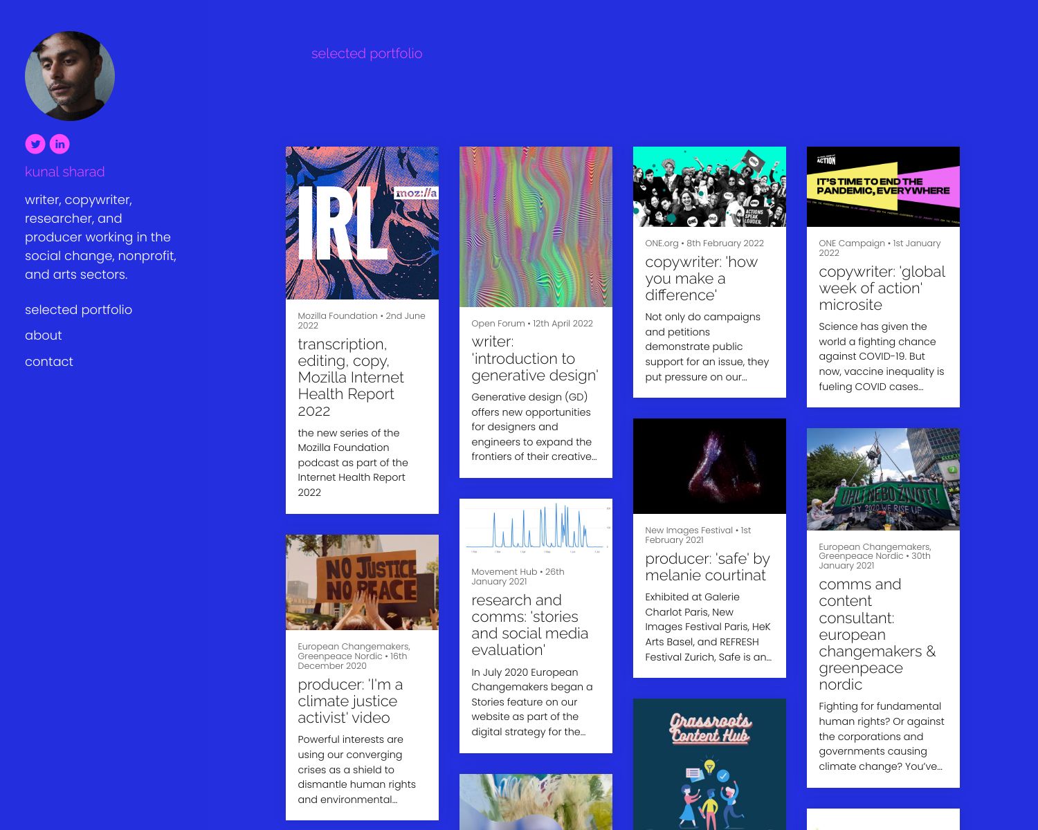
WHAT WE LOVE: Kunal isn't afraid of color for his copywriting portfolio, and his cobalt background helps the art images on his featured articles really pop, creating a vibrant and artistic aesthetic. He also makes full use of his About page to dive deep into his experience, educational background, and even the languages he speaks.
SPECIAL FEATURES: Clicking on one of his featured writing samples brings up a window with a brief summary of the work. A button at the bottom of the summary allows you to view the whole work if you'd like to proceed further. We love that this allows clients to do a quick review of all of his work without having to read every single piece.
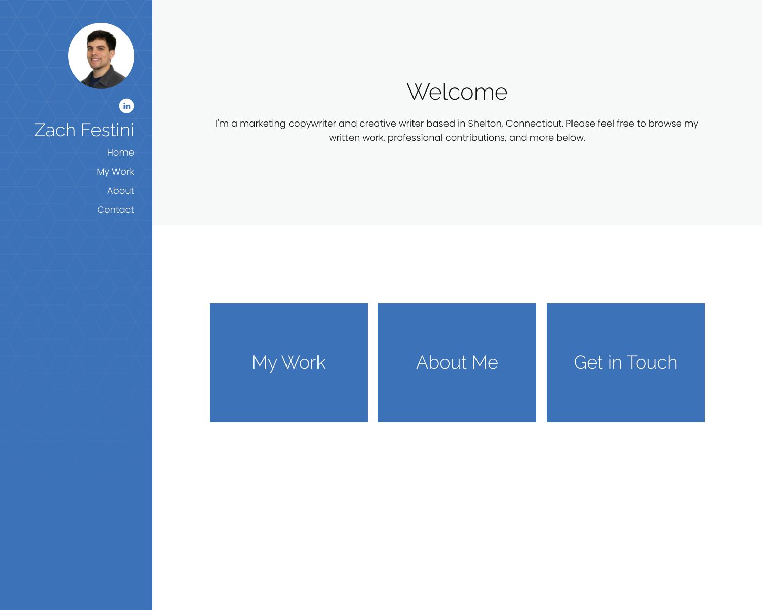
13. Zach Festini
Visit Zach's Portfolio here: zacharyjfestini.journoportfolio.com
WHAT WE LOVE: Zach uses a stripped down white and sky blue template to create a minimalist design. He personalizes his copywriting portfolio with a well-written, professional and yet personally inviting About page. His bio is an excellent example of showcasing your writing talent in a way that is appealing to your audience.
SPECIAL FEATURES: Zach uses buttons to keep his copywriting portfolio clean and straightforward. Buttons on his Home page lead to his Portfolio and About page. On his Portfolio page, buttons are used to access each separate type of content. And finally, when clicking one of his copywriting samples, you get a window with a summary and the choice to follow the URL to the full sample.
14. Lubna
Visit Lubna's Portfolio here: lubnarahmanpa.journoportfolio.com
WHAT WE LOVE: Lubna uses a saturated black and olive color scheme with white print to create a stand-out design. Her Home page includes a brief bio and testimonials, so clients know her specialty and her credentials right away. She also includes a rates and services page that lets clients know exactly what they can hire her for and how much it will cost.
SPECIAL FEATURES: Lubna utilizes a hidden menu so that it doesn't interfere with her design. This is a great option when you want the focus to remain on the totality of each page and not on the distraction of a visible menu.

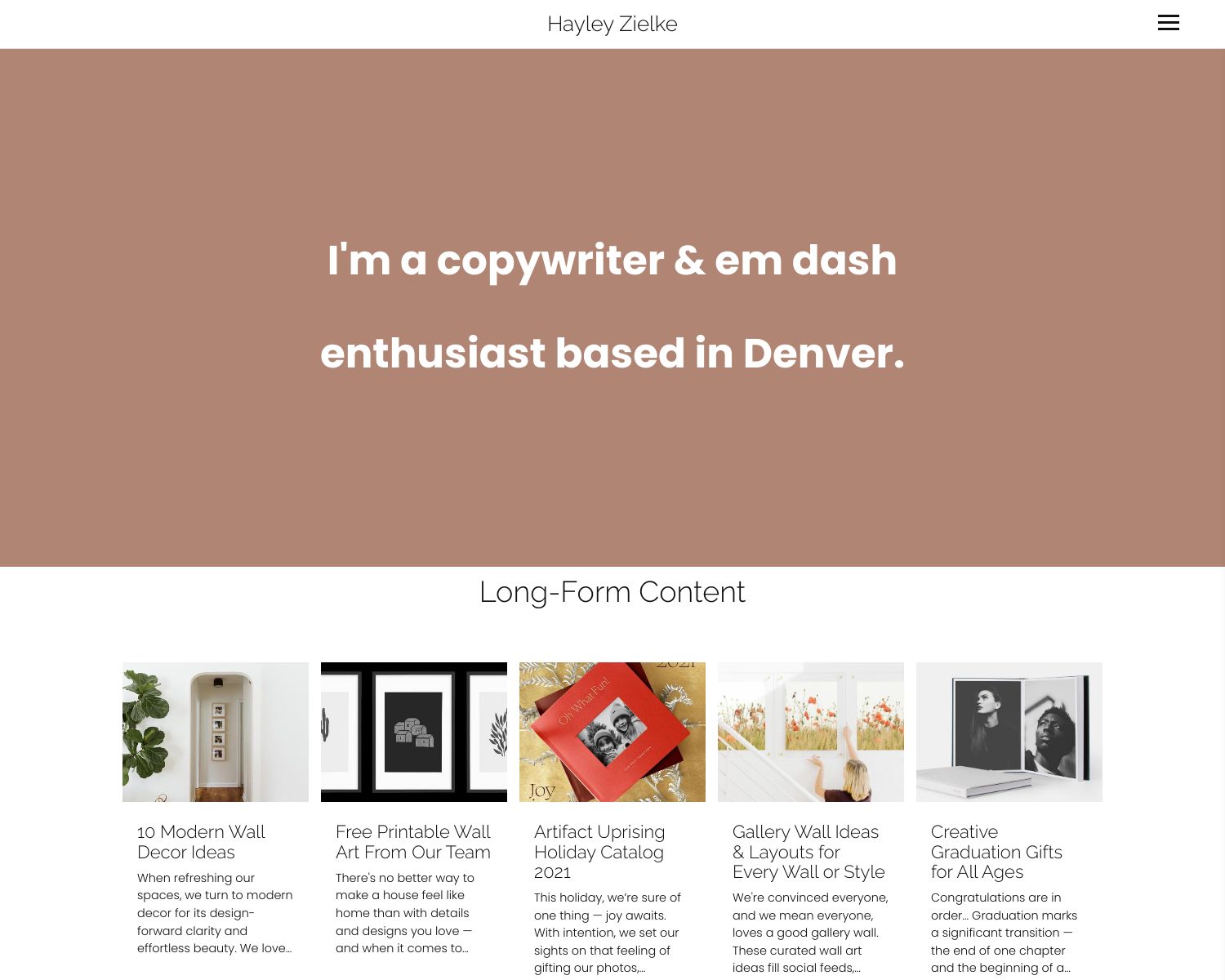
15. A. C. Cash
Visit A.C.'s Portfolio here: www.ashleycartercash.com
WHAT WE LOVE: A.C. combines her raw and unfiltered poetry, prose, and personal essays along with her copywriting work. Her black and white aesthetic matches the tone of her About page, where she rebrands her personal experience into a powerful tool to create interesting copy for clients. She also uses different formats for each of her pages, yet maintains the integrity of her overall design through color and font consistency.
SPECIAL FEATURES: A.C. gives site visitors a chance to sign up for her #parentingSLACKS newsletter, a smart way to keep potential clients informed of new work.
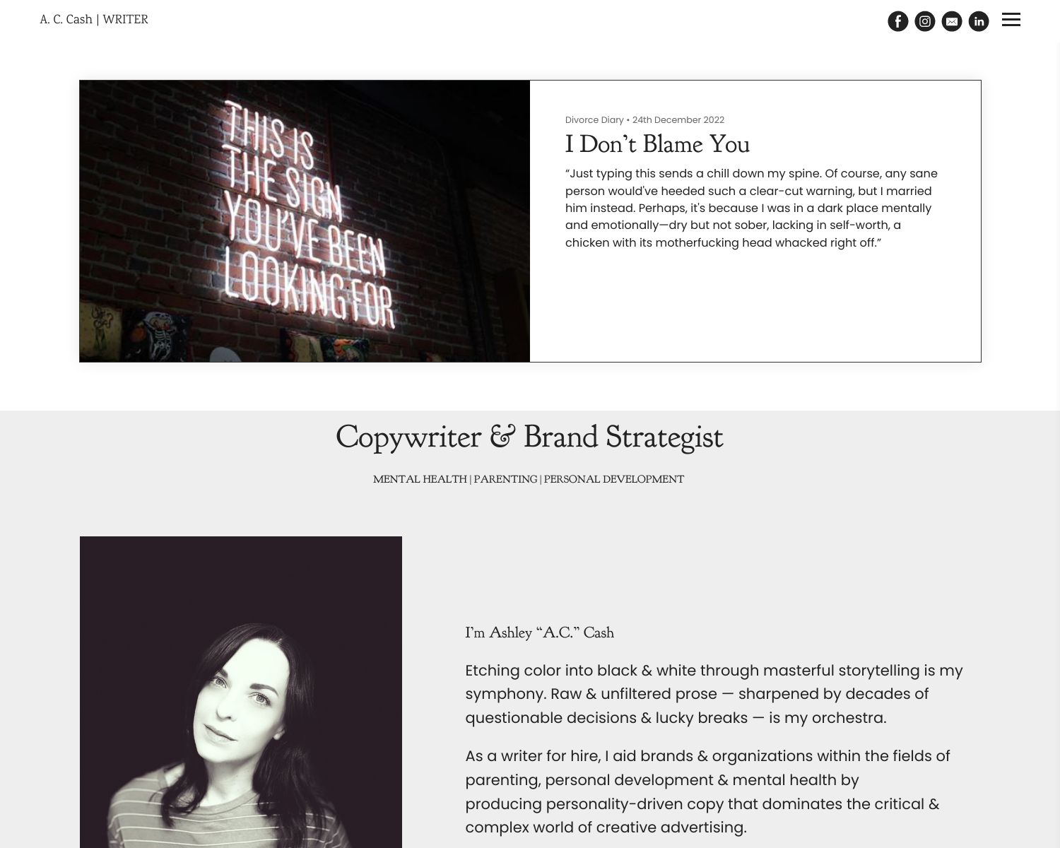
16. Alice Connolly O'Brien
Visit Alice's Portfolio here: aliceconnollyobrien.journoportfolio.com
WHAT WE LOVE: Because Alice works with several different outlets on a recurring basis, she divides her sidebar menu by platform instead of by page or content type. This creates interest and a sense that she has established herself enough to work with specialized clients.
SPECIAL FEATURES: Her stonewashed header and sidebar create an appealing color aesthetic that maintains consistency throughout her site, even as she varies layouts to feature different types of writing. This is a wonderful way to create visual interest while keeping your copywriting portfolio cohesive.
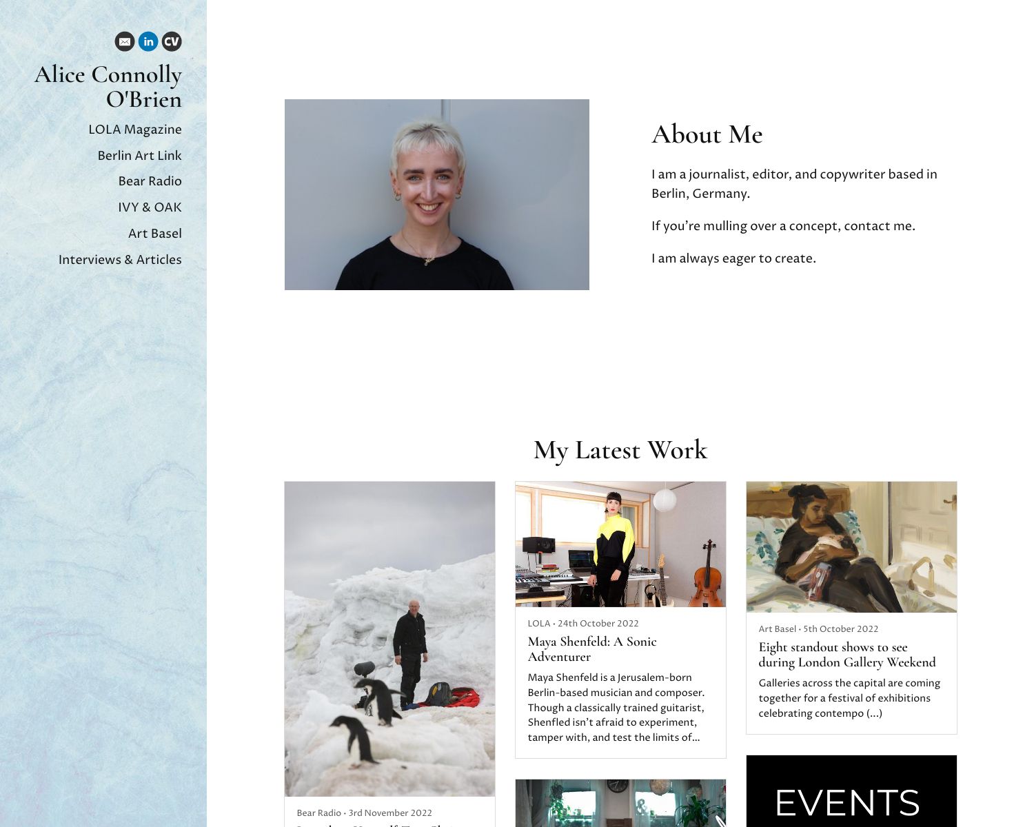
17. Hayley Zielke
Visit Hayley's Portfolio here: hayleyzielke.journoportfolio.com
WHAT WE LOVE: Hayley uses her About page as a mini resume, with a brief bio followed by a breakdown of her professional experience and educational background. This means she can use her copywriting portfolio to attract potential clients or as part of a job application. We also love that she matched her banner color with the sweater in her profile pic.
SPECIAL FEATURES: Hayley divides her Home page into different sections that display her featured work. Each section utilizes a different format, so that her page is visually impactful on both mobile and desktop.
18. Lena Rich
Visit Lena's Portfolio here: lenarich.journoportfolio.com
WHAT WE LOVE: Lena's gentle pastel color scheme is a great way to set off the professional-level photos that she features on her site. From her background photo to her button photos to her profile pic, Lena chooses images that compliment her copywriting.
SPECIAL FEATURES: Lena does a great job on her Portfolio page of choosing various formatting options for each section that best highlight her work. It's a great reminder to utilize all of your formatting options to create the best copywriting portfolio for you.

19. Steven Westwood
Visit Steven's Portfolio here: spwcopywriting.journoportfolio.com
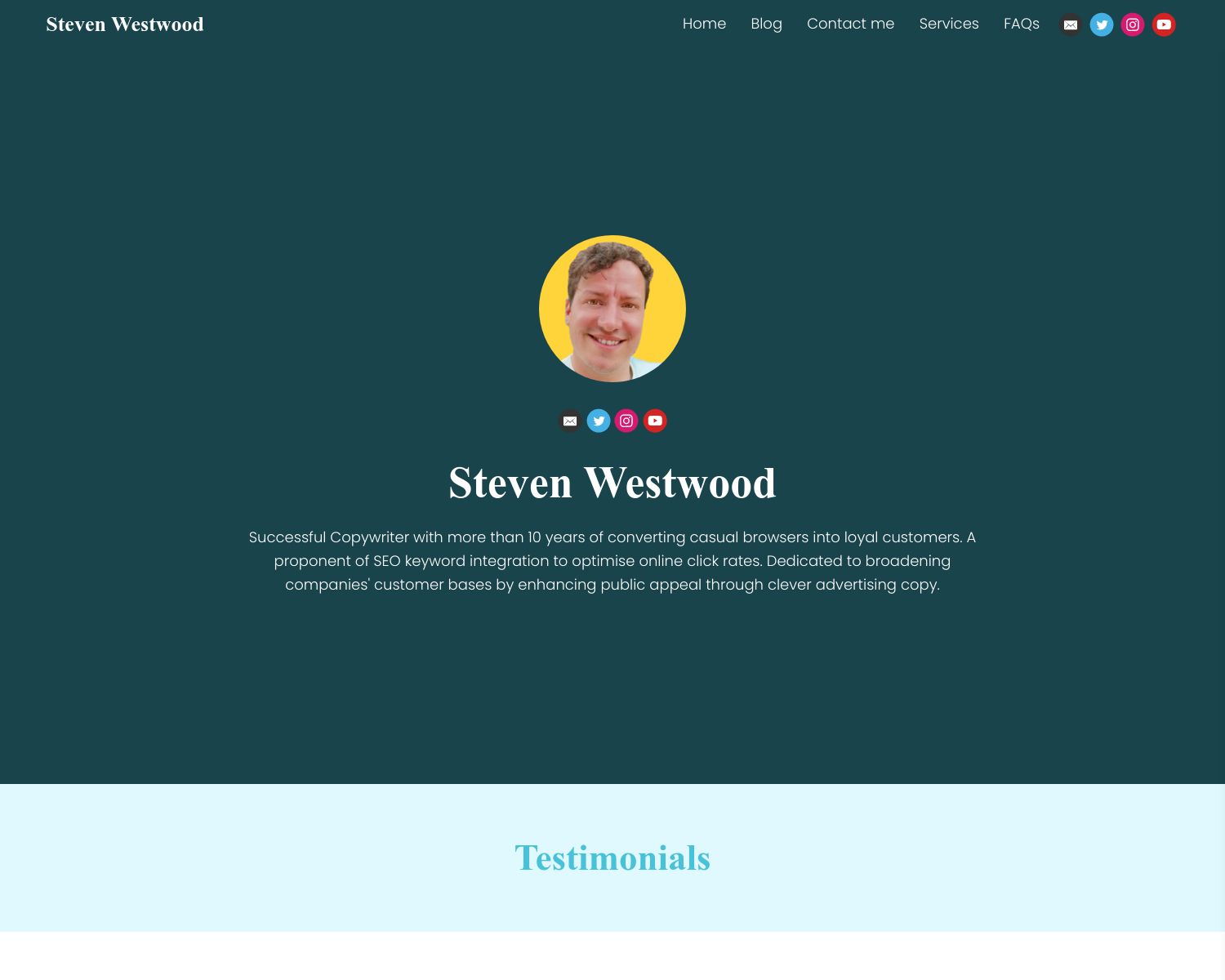
WHAT WE LOVE: Steven's Home page is designed to create conversions, with testimonials, a breakdown of his professional skill set, and contact information listed throughout the page. He also gives potential clients the option to sign up for his newsletter, which optimizes the number of visitors that turn into leads.
SPECIAL FEATURES: Steven maximizes the menu on his copywriting portfolio by providing a secondary dropdown menu under the Services option that allows you to navigate to copywriting samples relevant to your type of project. This gives him the chance provide a wide variety of copywriting samples while still keeping his site easy to navigate.
20. April M. Lane
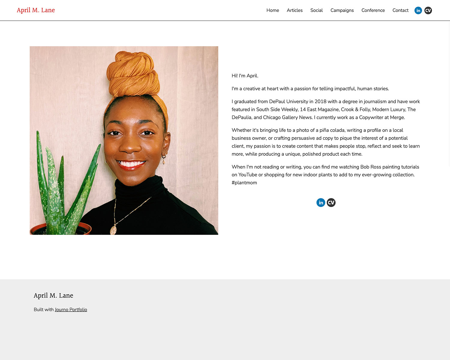
WHAT WE LOVE: April's copywriting portfolio Home page is inviting and welcoming due to her friendly bio and profile pic. Her header menu employs dropdown submenus, so each category of content can be easily found. She also created an exceptional design for her Campaigns page by offering potential clients the option of viewing each campaign in detail on its own separate page if they'd like.
SPECIAL FEATURES: April's social media page features a magazine format that allows her to share screenshots of social media posts she's designed. This gives visitors a clear idea of her style and creative copy for social media.
21. Dan Vaccaro
Visit Dan's Portfolio here: www.vaccaro-writer.com
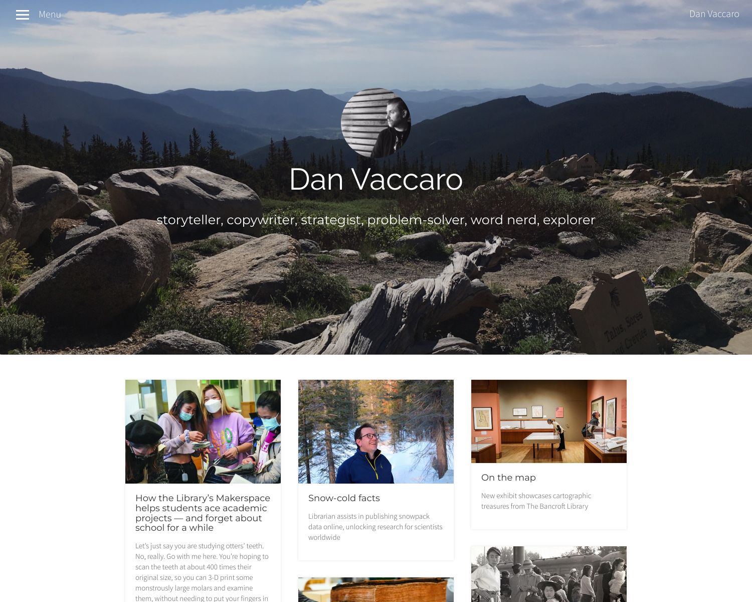
WHAT WE LOVE: Usually it's best to showcase only a few of your best copywriting examples, but Dan breaks the rules in just the right way. His Home page features an extensive sampling of his published work, and while it could seem overwhelming, it also speaks volumes about his experience level.
SPECIAL FEATURES: Dan includes a video page that allows you to watch his videos if you click on the featured card. If you also write scripts for videos or podcasts, it can be an outstanding addition to your copywriting portfolio to include these alongside your writing samples.
22. Cassidy Slockett
Visit Cassidy's Portfolio here: cassidyslockett.journoportfolio.com
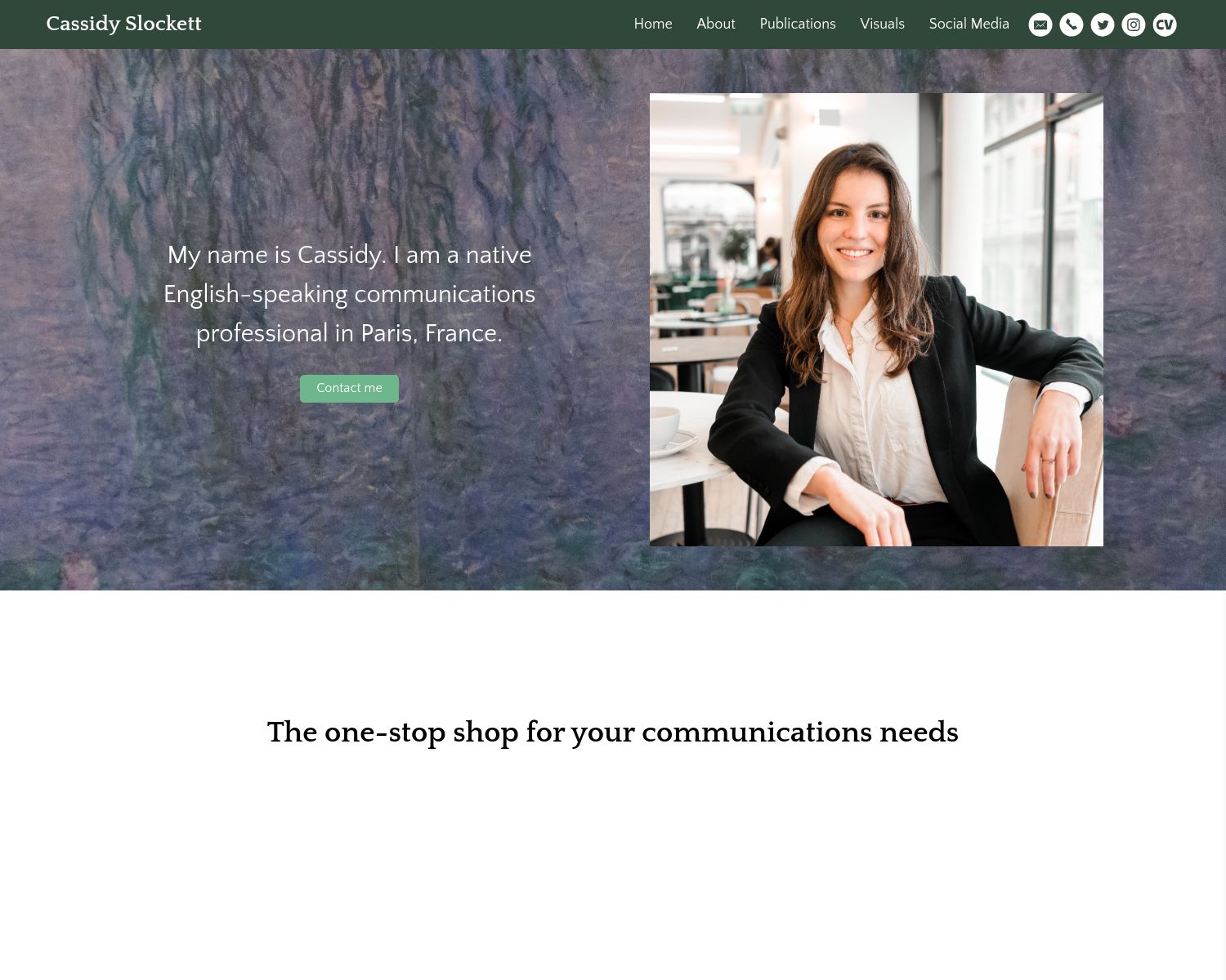
WHAT WE LOVE: Cassidy makes great use of the Journo Portfolio layout options to create a very interesting and unique portfolio site. The bold green color choice makes the site distinctive and memorable. The flowers on her home page are a nice visual flair to make the display of her services more interesting.
SPECIAL FEATURES: She uses a drop-down "Folder" menu option to have a non-clickable menu drop-down to better group her navigation and make a clearer hierarchy.
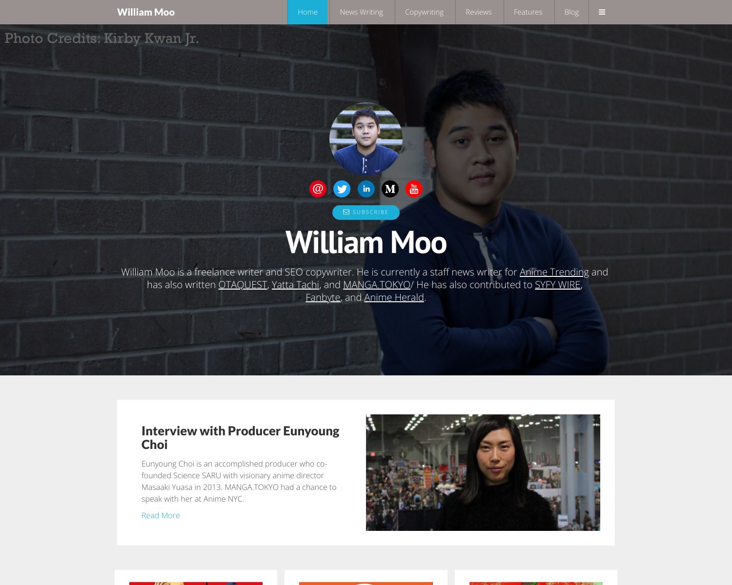
23. William Moo
Visit William's Portfolio here: wmoowriter.journoportfolio.com
WHAT WE LOVE: William creates a tech savvy design that shows off his anime copywriting brilliantly. He features his social media buttons and email list sign-up directly under his profile pic, which is the first thing you see when visiting his copywriting portfolio. This encourages ongoing engagement with potential clients and fans.
SPECIAL FEATURES: William has both a header menu and a hidden menu. When you click on the hidden menu, it shows you all menu options at once, including secondary drop down menus. In this way, his hidden menu serves as a full site map.
24. Josh Schultz
Visit Josh's Portfolio here: joshschultz.journoportfolio.com
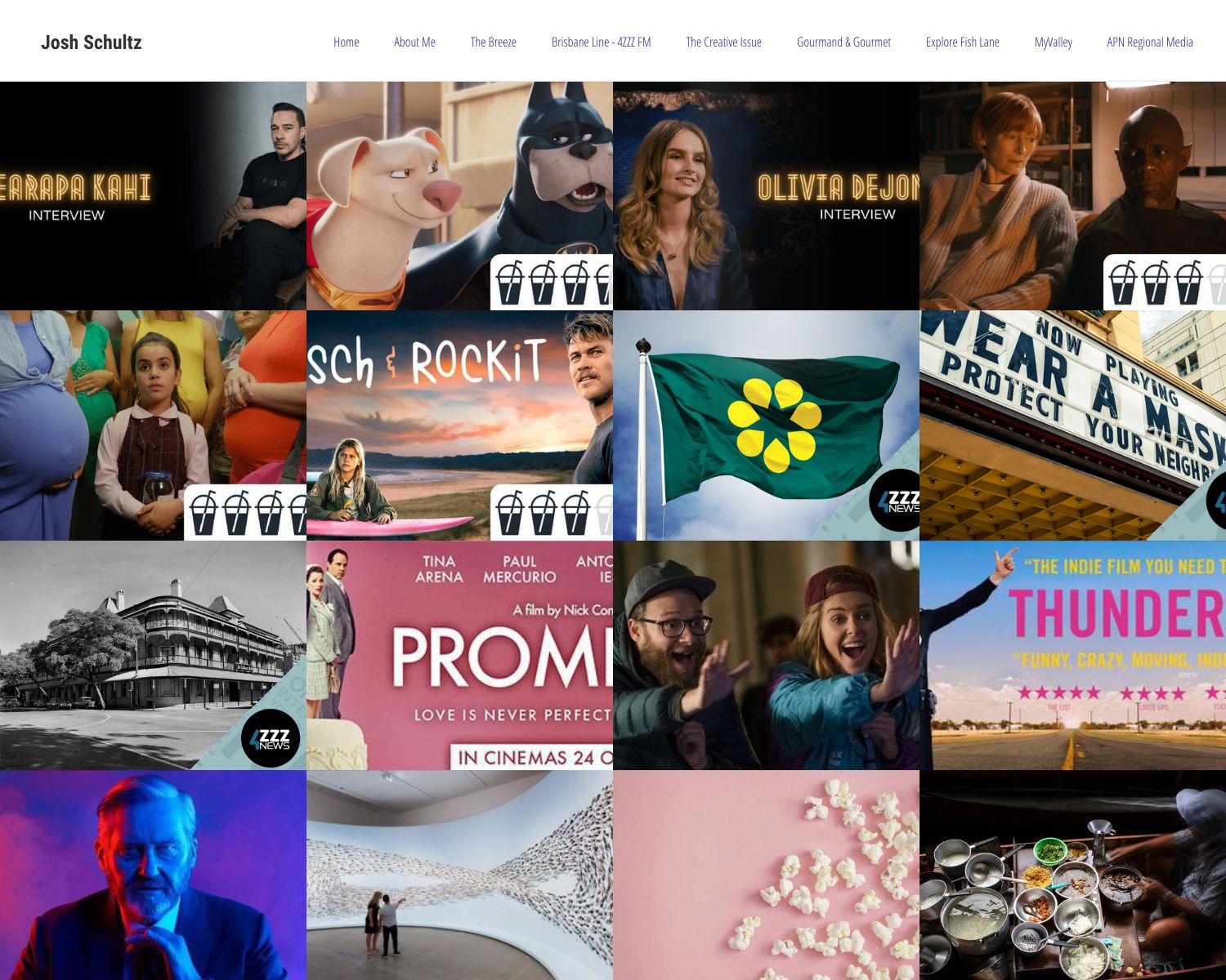
WHAT WE LOVE: This visually stunning portfolio opens onto a Homepage with block formatting filled with appealing photography. He uses this same formatting on each page of his copywriting portfolio, which is divided by publication outlets. This keeps text to a minimum and visual impact to a maximum.
SPECIAL FEATURES: When hovering over a photo, the article title, publication, and summary appear, inviting you to click and read more. This feature lets you keep the allure of a photo-heavy portfolio while still displaying your copywriting samples.
25. Marisa Christiano
Visit Marisa's Portfolio here: marisachristiano.journoportfolio.com
WHAT WE LOVE: Marisa takes a different approach and places her nav menu at the bottom of her broad header. That means the first thing you notice isn't her menu, but her sales pitch and profile picture. We also like the brief summary she includes at the top of each section of content.
SPECIAL FEATURES: Because of where she places the menu, when you click on a new page, the content appears below her header instead of seeming to kick you to an entirely new page. This gives the impression of always remaining on her Home page while browsing her copywriting portfolio.
Ready to build a copywriting portfolio of your own?
We hope these copywriting portfolio examples have inspired you to create a copywriting portfolio of your own to showcase your skills and experience. Whether you're a freelancer or looking to get hired in-house, a well-designed professional portfolio can help you land your next gig. Find out more here.


