What is a Call To Action and How to Create One for Your Digital Portfolio

Jessica Michael
Published onA digital portfolio is a great way to organize your work samples, whether you're a photographer, a writer, a digital marketer or other creative. But your online portfolio can do so much more than just showcasing your work and making it easy to share.
A digital portfolio is also an excellent marketing tool that you can utilize to build clientele, advertise your services, and coordinate with your social media presence. However, getting visitors to your site is only the first step in your marketing strategy. In order to turn site visitors into clients, you need to be sure your portfolio has at least one compelling call to action.
In this guide, we'll teach you what a call to action is, how to create an effective CTA, and ways to include one on your digital portfolio site.
What is a call to action?
A call to action (more commonly referred to as a CTA) is a marketing term used to describe anything that encourages people to take a committed action like buying a product or signing up for a subscription.
Most commonly, we think of CTAs as marketing copy that inspires potential clients or customers towards a particular course of action. CTAs show up on websites, social media posts, advertisements, email newsletters and anywhere marketing copy is used to promote an action.
Think of a CTA as the marketing text that leads to the final step of a sales process.
In addition, almost all CTAs are hyperlinked to lead potential clients to the sale. Hyperlinks can go directly to a services or products page, to social media accounts, or to fillable forms. They may connect with informational pages or scheduling services.
CTAs that are incorporated into buttons or other elements of a site may be more directly related to a sale, such as a Buy Now button under a product description which places a product in a customer's cart.
Any actionable marketing text can be considered a call to action.
Sales funnel
Understanding what a CTA is and how best to implement one is easier if you are familiar with what's called a "sales funnel" in the marketing world.
A sales funnel refers to the steps taken to get someone who is a potential client to become an actual client and usually consists of some version of the following 4 stages.
Stage 1: Awareness
This refers to the point at which you first come to a potential client's attention. Marketing and PR techniques that are useful here include advertising, social media, articles and interviews, and word-of-mouth.
Stage 2: Interest
Once someone hears about you and knows you exist, then you need to generate interest in what you have to offer. Brand messaging is important here, and marketing techniques such as special offers, email lists, and social campaigns might be used. A well-designed portfolio site is a tool that can help generate interest as well.
Stage 3: Decision
This is the point where a potential client is thinking seriously about whether or not to hire you or buy your product. White papers, price comparisons, testimonials, demos, and free consultations can help someone decide to use your services. A digital portfolio that includes excellent work samples, relevant services, and a professional About section or CV are great ways to convince a potential client to commit.
Stage 4: Action
Stage 4 is when a potential client is ready to become an actual client, and this is where a quality CTA comes in. Once a client has decided on you, you want to make it easy for them to seal the deal. This can mean a button that links to your scheduling software for a consultation, a link that leads to your contact page, or any other easy-to-use actionable element of your site.
And remember, not everyone is ready to commit, so having a way to develop and keep leads long term even if they don't result in a short term deal is important. Things like including an email sign-up or social media buttons can do the trick for this.
Getting familiar with how a sales funnel works and taking the time to design one for your own business will make it much easier to figure out what action or actions you want visitors to your site to take and how to make it easy for them to do so.
Common examples of CTAs
If you are online at all, then you've come across many CTAs-- you just might not have realized that's what they are. Common CTAs encourage website visitors to:
Buy a product or service
Sign up for a subscription
Follow on social media
Sign up for a newsletter
Sign a petition
Schedule an appointment or consultation
Download information
Join an online community
Leave a comment
Engage with a social media post
Get a demo
Contact for more information
As you can see from these examples, anything that encourages an action that results in a sale or which grows a client list is considered a CTA. Some CTAs have immediate results (like selling a product), and some may lead to future sales (like adding a potential new client to an email list). All of them result in ways to grow your client base.
How to phrase a CTA
CTAs are often simple phrases found within text or on website elements such as buttons. While it's important to be clear about the action you want a site visitor to take, it's also important to avoid wording it in a way that seems demanding or pushy.
Short, informational phrases work well, as do questions. Each CTA should be hyperlinked (i.e. linked to your contact form), connected to a fillable form (i.e. a pop-up email capture), or result directly in an action (i.e. a follow button for your social media account).
A few examples of effective CTA phrasing include:
"Learn more here."
"To schedule a free consultation, contact me here"
"Have questions? Call us today."
"Follow us on Instagram."
"Keep up with the latest news by joining my email list."
Keep your CTAs informational and conversational. It's also great if your CTAs are located alongside or embedded in text that explains the benefits of what you're offering and why they should follow the call to action that you recommend. For example, a passage that talks about the benefits of joining your community on social media should include a hyperlinked social media button at the end.
Deciding on a call to action
The easiest way to decide on an effective call to action for your portfolio site is to define the action you most want visitors to the site to take. Are you looking to expand your social media following or email list? Are you a freelancer who wants someone to hire you for your services? Do you want editors, publishers, or potential jobs to dive into more of your work? Would you like people to be able to schedule an appointment?
Figuring out the primary purpose behind your portfolio will help you design a portfolio with relevant CTAs. In marketing, "conversion" refers to the process by which you convert a site visitor into a client, customer, or follower. Knowing what you'd like to convert your digital portfolio visitors into will also help you decide on a CTA.
Can you have more than one CTA?
The short answer is yes.
Just as portfolio websites can have multiple pages with a variety of purposes, you can also have more than one CTA for different purposes. Perhaps you want a way for a potential client to sign up for a free consultation, but you're also building an email list. Including separate CTAs for any actions you want to encourage is an excellent marketing strategy.
We recommend you prioritize which CTAs are the most important and what is most likely to succeed.
In addition, it can be helpful to think of CTAs as primary and secondary.
Your primary CTA is going to be the most important action a visitor to your site can take. If you sell services, that's usually going to be to sign up for services or to schedule a consultation.
Your secondary CTAs include anything else that will keep a lead alive after they've left your site. For example, signing up for an email list or a demo will give a potential client access to more information so that they are more likely to choose you when they are ready. Since not every customer is ready to commit, secondary CTAs can make sure you don't lose a future client by keeping them in contact with you.
Creating a compelling CTA
Compelling CTAs are easy to find and easy to do.
Your most important CTA should be front and center on your portfolio site, not buried on your least visited page. And don't be afraid to repeat your CTA across pages and in different formats. For example, if you want people to contact you, you might include a hyperlinked CTA at the end of your About Me section, as well as a button across several pages that links to your contact form.
Similarly, the fewer steps a prospective client has to go through to accomplish the CTA, the better. If you want someone to sign up for your email list, for instance, create a pop up or easy-to-access form.
CTAs are also most effective when they accompany text that convinces a client of the WHY behind the call to action. Why should someone schedule an appointment with you or reach out for more information?
Most common CTAs for a portfolio website
Most portfolio websites are either selling services or showcasing creative work (or both). Because they aren't usually used to sell a product or to spread information, there are some CTAs that are more common on a portfolio website. These include encouraging visitors to:
Make an appointment for a consultation
Follow on social media
Sign up for a newsletter
Contact for more information
View a CV
You may also want to encourage visitors to view an embedded video, listen to an interview, or explore your work more thoroughly. CTAs can be created for any goal you have for your portfolio.
Easy ways to include a CTA on your Journo Portfolio site
Journo Portfolio already has in-built features that can act as effective CTAs. In addition, you can add several elements to your site for even more ways to create CTAs.
Social media buttons
Social media buttons can be included as part of your Nav Menu. You can also add them across pages and sections.

Email sign-up
Journo Portfolio has an option where site visitors can sign up for a weekly email that will inform them of any new articles or work samples you add.

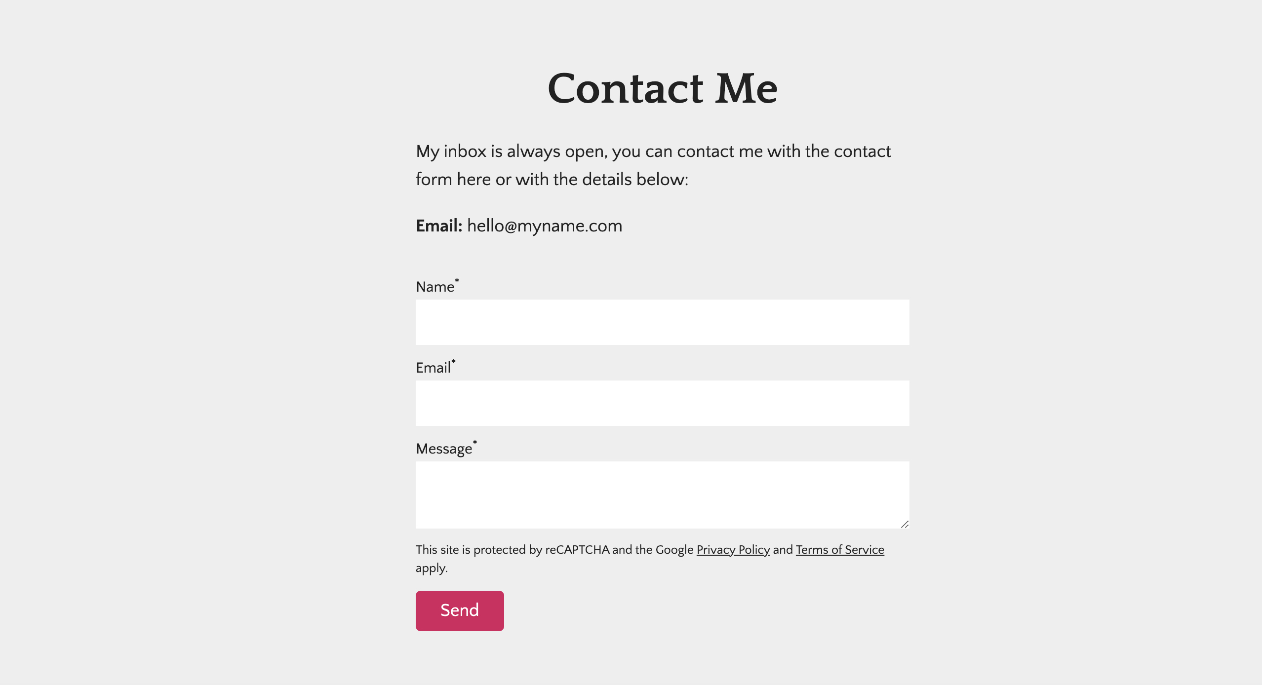
Contact page
Journo Portfolio templates include a contact page, which can be hyperlinked to other sections or buttons throughout your site.

Blog articles
It's easy to set up a blog on your Journo Portfolio website, and blog articles are a great way to market your business. Every blog article should end with a hyperlinked CTA for readers.
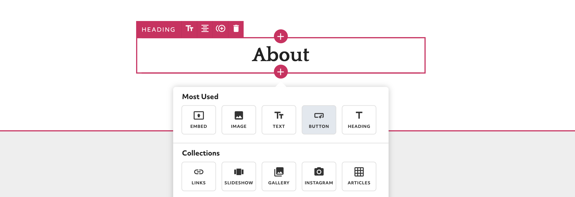
Buttons
Buttons can be added wherever you'd like on your digital portfolio site. They can be linked to other pages or sections of your portfolio, or they can link to an outside site.

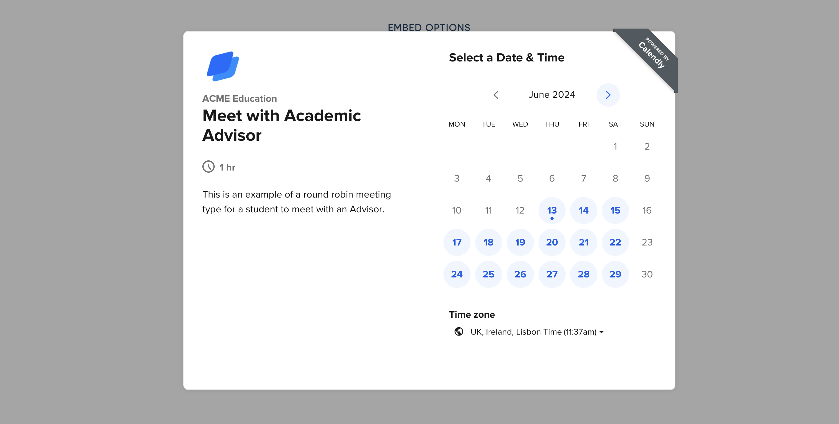
Scheduling appointments
You can use a button or other hyperlink to connect directly with a scheduling service such as Calendly. That way, people can get on your schedule without having to take additional steps.

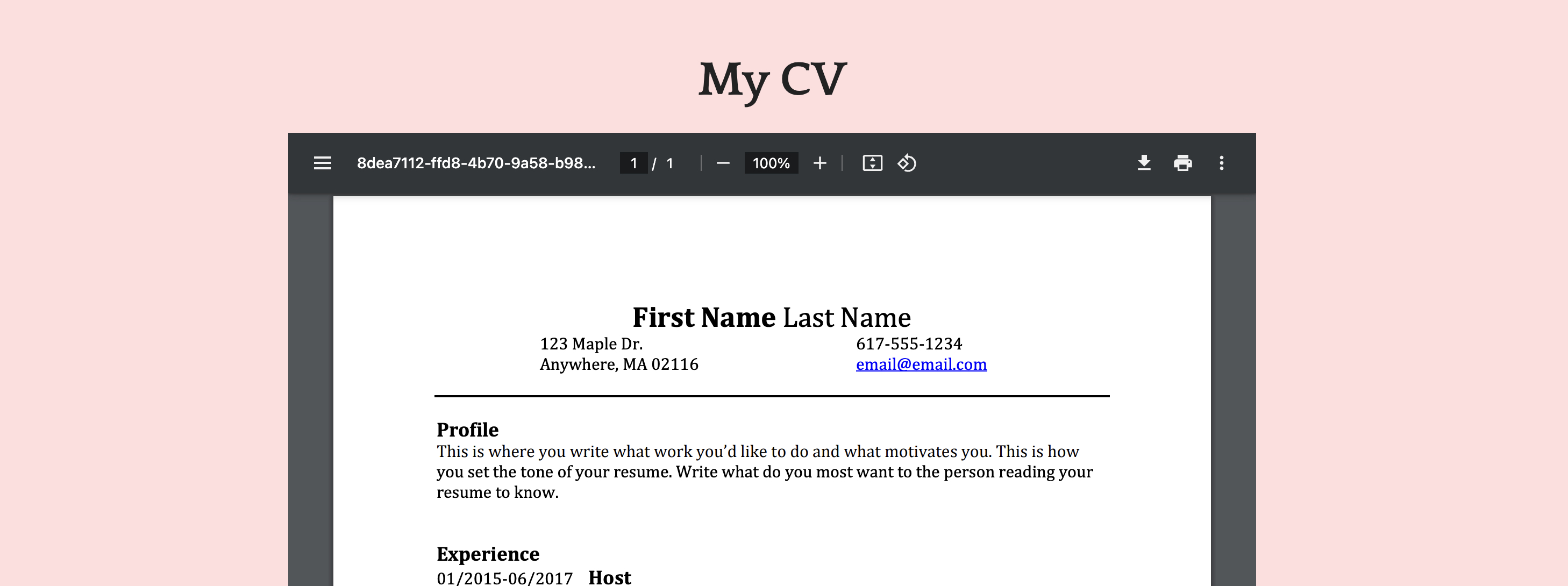
CV or resume inclusion
You can upload your CV or resume to your portfolio so that potential clients or employers can easily find it.

Linking sections and pages
Journo Portfolio's editor makes it really simple to create links between pages and/or sections. This is especially useful if your CTA is to encourage visitors to look at more of your work.
Journo Portfolio's themes are designed to not only display your work but to market your skills. If you're interested in more ways to create CTAs, check out our Features page.


